


 0 comments
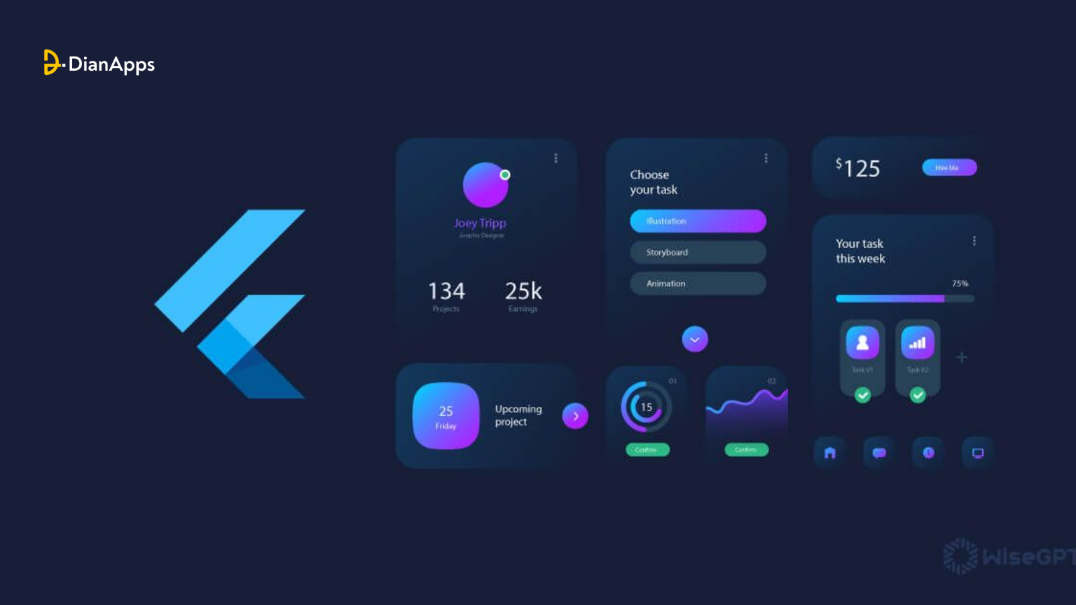
Developing a Flutter app for your business or personal interests opens up a world where ideas come to life through the power of widgets. These fundamental components form the backbone of every Flutter application, delivering the visual and interactive elements that shape user experiences.
As you look deeper at the dynamic ecosystem where everything is a widget, having a strong knowledge of key components is essential for enhancing your app development skills. In this article, we’ll explore 10 essential widgets that will entitle you to enhance your Flutter app development projects.
What is a Widget in Flutter?
Flutter, Google’s UI toolkit, empowers developers to create visually stunning, cross-platform iOS and Android apps with a unified codebase. At its core, every aspect of mobile app development services revolves around widgets. These fundamental elements are the building blocks of Flutter applications, dictating how the app’s view should appear based on their configuration and state.
Whenever modifications are made to the code, widgets dynamically rebuild their descriptions, calculating minimal changes needed for rendering in the app’s UI. This reactive approach ensures efficient rendering and a seamless user experience.
Generally, widgets are organized in a nested hierarchy, with the root of the app itself being a widget, and every component within it also being a widget. Whether displaying content, defining design elements, or handling user interactions, widgets serve as the basis of Flutter app development, facilitating the creation of visually appealing and responsive cross-platform apps with ease.
You may also like to read: What do you expect from Flutter 4.0: New and Improved?

Widget Tree
Categories of Widgets
- Accessibility: Enhance accessibility features within the Flutter app.
- Animation and Motion: Add animation effects to widgets.
- Assets, Images, and Icons: Manage assets like images and icons.
- Async: Implement asynchronous functionality.
- Basics: Essential widgets for Flutter app development.
- Cupertino: Widgets with iOS design aesthetics.
- Input: Widgets for user input functionality.
- Interaction Models: Manage touch events and navigation.
- Layout: Arrange widgets on the screen.
- Material Components: Widgets following Google’s Material Design.
- Painting and Effects: Apply visual effects to child widgets.
- Scrolling: Enable scrolling for non-scrollable widgets.
- Styling: Handle app theming, responsiveness, and sizing.
- Text: Display text content.
Types of widgets in Flutter
Stateful Widgets
A StatefulWidget in Flutter comprises a widget and a corresponding state object. Unlike stateless widgets, StatefulWidget can dynamically change its internal data during its lifetime. It doesn’t have a build() method but instead implements the createState() method, returning a class that extends Flutter’s State Class. Examples include Checkbox, Radio, Slider, InkWell, Form, and TextField.
|
1 2 3 4 5 6 7 8 9 10 11 12 13 14 15 16 17 18 19 20 21 22 23 24 25 26 27 28 29 30 31 32 33 |
Example: class Car extends StatefulWidget { const Car({ Key key, this.title }) : super(key: key); @override _CarState createState() => _CarState(); } class _CarState extends State<Car> { @override Widget build(BuildContext context) { return Container( color: const Color(0xFEEFE), child: Container( child: Container( //child: Container() ) ) ); } } |
Stateless Widgets
A stateless widget in Flutter represents a static part of the user interface that remains unchanged over time. It’s typically used to describe UI elements that don’t rely on dynamic data or user interactions to change or update. Stateless widgets are static and only rebuild under specific circumstances: when first inserted into the widget tree, when their parent widget’s configuration changes, or when an inherited widget’s configuration changes. While stateless widgets like Text, Icon, IconButton, and CircleAvatar offer simplicity and efficiency, it’s crucial to optimize them if frequent rebuilds occur to ensure optimal performance in Flutter applications.
|
1 2 3 4 5 6 7 8 9 10 11 12 13 14 15 |
Example: class MyStatelessCarWidget extends StatelessWidget { const MyStatelessCarWidget ({ Key key }) : super(key: key); @override Widget build(BuildContext context) { return Container(color: const Color(0x0xFEEFE)); } } |
Top Flutter Widgets to use in your Flutter App
Flutter SVG
While Flutter doesn’t offer native support for rendering SVG images due to complexity and computational demands, the Flutter community has addressed this gap with the flutter_svg package. This Dart package enables developers to seamlessly integrate SVG rendering capabilities into their Flutter applications. By leveraging flutter_svg, developers can harness the benefits of SVG images, such as scalability and quality preservation, while maintaining compatibility with Flutter’s framework. This community-driven solution empowers Flutter app development companies and developers to incorporate SVG assets into their projects, enhancing flexibility and visual appeal in their applications.
Flutter_screenutils
Flutter_screenutils is a powerful widget that simplifies the challenge of ensuring your app scales effectively across various screen sizes. By setting a design size, developers can establish a reference point for layout and font sizing based on design specifications. This widget offers methods like .w and .sp to automatically adjust container widths and font sizes to match the desired design size across different screens.
The beauty of Flutter_screenutils lies in its ability to eliminate the need for manual media queries, streamlining the development process and ensuring consistent and visually appealing app experiences across devices. With Flutter_screenutils, developers can confidently create responsive Flutter apps without worrying about screen size discrepancies, enhancing efficiency and productivity in app development endeavors.
ConstrainedBox
ConstrainedBox in Flutter enables developers to impose size constraints on its child widget, such as limiting the height or width. This is particularly useful for adjusting text layout, ensuring it spans multiple lines when necessary to meet design requirements, enhancing flexibility and aesthetics in app interfaces.
Row and Column
In Flutter, Row and Column widgets serve as the foundational layout components for organizing UI elements horizontally and vertically, respectively. They accept lists of children widgets, allowing developers to arrange and position elements according to their design requirements. However, if the number of children exceeds the available space, it can lead to overflow errors. To address this, developers can implement scrollable solutions like SingleChildScrollView or ListView, enabling users to navigate through the content seamlessly. Row and Column widgets play a critical role in structuring Flutter apps, facilitating intuitive and visually appealing user interfaces.
GestureDetector
The GestureDetector widget in Flutter adds interactivity to any widget it wraps, enabling users to interact with the widget through gestures. While it is typically non-visual, developers can utilize the InkWell widget for a visually enhanced detector. GestureDetector offers various callbacks, such as onTap, which triggers when the user taps the widget, and onLongPress, activated when the user taps and holds the widget. These callbacks provide developers with the flexibility to implement custom behaviors and responses based on user interactions, enhancing the user experience design in Flutter applications.
ListView
The ListView widget in Flutter provides a scrollable list of children, allowing users to navigate through content in a specified direction, such as vertical or horizontal, determined by the Axis instance. It offers versatility with three constructors: ListView.builder, ideal for displaying an infinite number of children efficiently using the IndexWidgetBuilder; ListView.separated, suitable for displaying a fixed number of children with separators between them; and ListView.custom, which delegates the number of children shown in a viewport at a time, offering flexibility in managing the display of content within the viewport of the ListView widget.
PageView Widget
The PageView widget in Flutter facilitates the creation of onboarding screens and carousels within apps. By organizing its children as scrollable pages, developers can easily implement features like swiping through screens to introduce users to app functionalities or showcase content. Each child of the PageView automatically adjusts to fit the size of the viewport, ensuring a seamless user experience. The PageController property enables developers to control which page is visible on the viewport and specify the initial page displayed when the PageView is first constructed, offering flexibility and customization options in Flutter app development.
GridView widget
The GridView widget in Flutter is ideal for displaying a collection of items in a grid layout, resembling a table structure both vertically and horizontally. It is commonly used for creating gallery apps or displaying images in a grid format. The widget offers properties like crossAxisAlignment and mainAxisAlignment to control the spacing between grid items based on the scroll direction. This allows developers to customize the layout according to their design preferences, ensuring optimal spacing and alignment of items within the grid in Flutter applications.
Wrap widget
The Wrap widget in Flutter provides a flexible layout solution for arranging widgets when there is insufficient space in a row or column layout. It automatically moves items to the next line, allowing for a multi-line display of widgets. This is particularly useful for widgets like Chip, where the number of items may vary dynamically. The direction property enables developers to specify whether children should be laid out vertically or horizontally, providing versatility in adapting to different layout requirements and optimizing the presentation of content in Flutter applications.
Opacity
The Opacity widget in Flutter enables developers to adjust the transparency of its child widget, allowing for the creation of visually appealing effects such as fade-in and out animations or inactive buttons. With a single opacity property ranging from 0.0 to 1.0, where 0 represents complete transparency and 1.0 signifies full opacity, developers can control the level of transparency applied to the child widget. For dynamic opacity adjustments, developers can utilize the AnimatedOpacity widget, facilitating smooth animations when transitioning between different opacity levels in Flutter applications.
Final Words
Mastering these 10 essential Flutter widgets is a trump card for you to ace in Flutter App Development services. By leveraging the potential of these widgets, mobile app developers can create interactive, powerful, and visually attractive applications that attract users across multiple platforms. As the Flutter framework continues to grow, understanding these necessary building blocks will empower app developers to offer engaging and forward-looking experiences to the audience.
If you’re looking to integrate these widgets in your Flutter app and are confused about how, worry not! Hire Flutter app developers from DianApps and let them do the brainstorming and help you choose the best widgets for your Flutter app.
 0 comments


Leave a Comment
Your email address will not be published. Required fields are marked *