


 0 comments
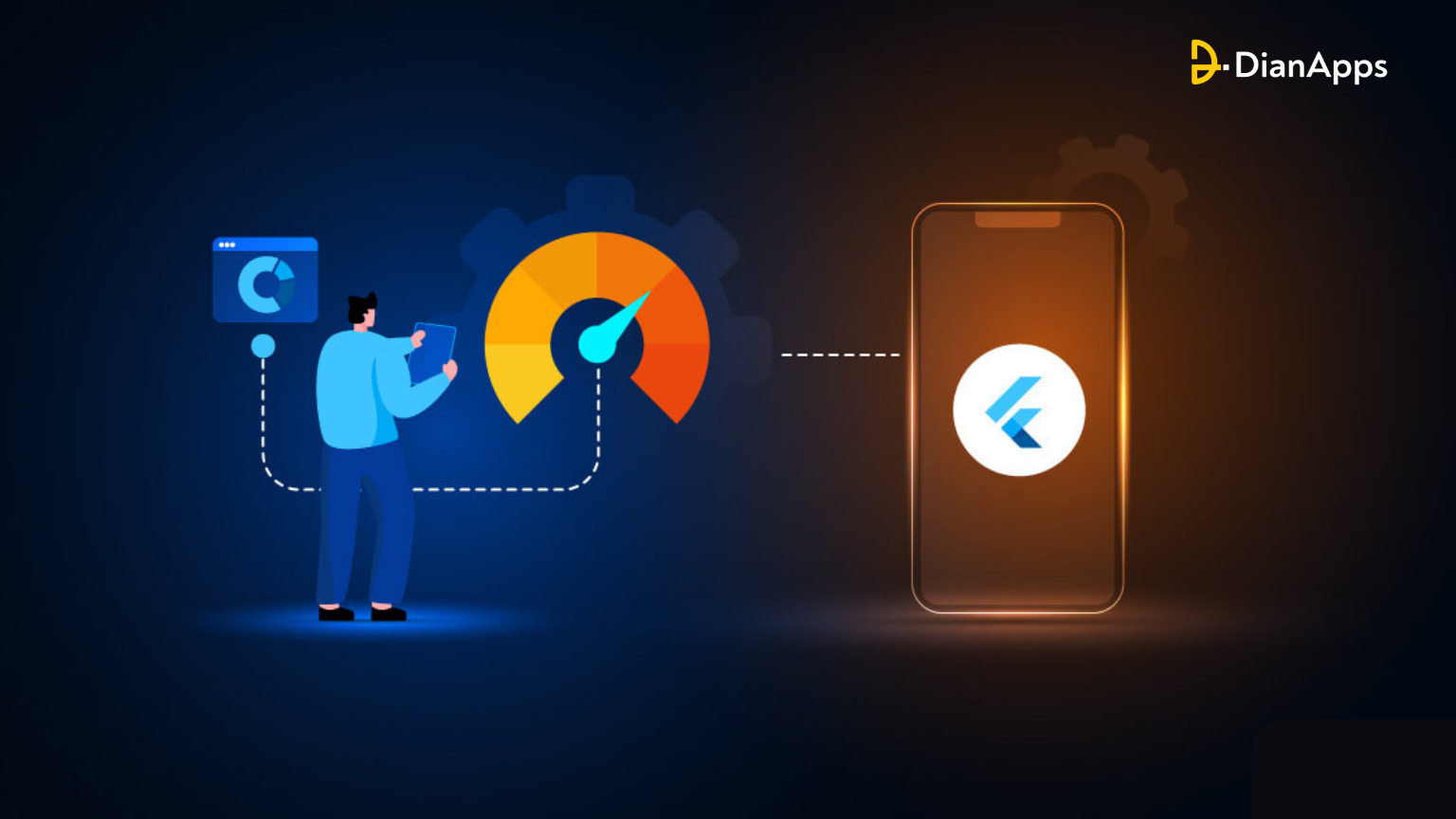
Changes are critical for app configuration. You’ve probably noticed that when a user rotates the phone vertically or horizontally, the keyboard appears. The release of multi-window features for Android, foldable smartphones, and Catalyst for iOS (the project that allows users to run iOS apps on macOS) has revealed an infinite number of screen sizes.
If you want your app design to be polished, it should “react” appropriately to configuration changes. Many Flutter developers struggle with the responsive design available in the Flutter infrastructure. In this blog, we’ll share our experience in creating a responsive app with Flutter app development.
But first of all, let’s know the basics!
What is Responsive Design?
What is meant by responsive design?
A website development and design technique that allows a website, application, or software to adapt to the size of the screen of a user is known as Responsive design. Simply put, the interface of an application, website, or software fits in the device’s layout. When you build a web page/application responsive to the device at hand, it ultimately improves a user’s browsing experience.
The idea behind responsive design is to use a single set of code that adapts to different layout changes associated with other devices (smartphones, tablets, and desktop computers).
However, making an existing site responsive can be difficult, but the benefits of making an app responsive can be far more beneficial. Let’s look at the importance with respect to Flutter!
Why is responsive design important in Flutter?
Wider Audience Reach: Responsive Flutter apps appeal to a broader audience by maintaining consistency across various screen sizes, ensuring a tailored experience on tablets and smaller devices.
Higher Retention Rates: Integrating responsiveness in your Flutter app leads to improved user retention, keeping your users engaged and satisfied.
Versatile Choice: Flutter is a versatile platform for both web and mobile apps, and responsive design ensures a smooth user experience regardless of the device in use.
Positive Reviews: With millions of apps out there, positive reviews matter. Responsive design can prevent negative ratings and keep your app on the good side of user opinions.
Now, you’ll want to be on the good side of these reviews. Hence, you should factor responsiveness into your mobile app development services checklist.
Goals of Responsive App Design
Responsive design has several important goals that benefit both users and businesses:
- Larger Audience
Responsive design catches the attention of a larger audience by making sure that an app or a website can run on a variety of devices. Users can have a better and more consistent experience while operating the software on any device, be it a mobile, tablet, or desktop computer.
- Lead Users to Purchase
A well-designed responsive interface considers user emotions and guides them intuitively through the user journey. Anticipating user stories and ensuring a smooth flow can lead to higher conversions.
- Brand Awareness
A visually appealing design improves the brand recognition and user experience of a website. If your plan is consistent and attractive distinguishes your brand from competitors.
- Improved SEO
Search engine optimization benefits from responsive web design. It results in more backlinks and lower bounce rates, which improves the app’s search engine rankings.
- Improved Browsing Experience
With responsive designs, users don’t need to adjust or zoom their screens, allowing them to use the app both offline or online.
As mobile browsing gets popular with every passing day, responsive designs are preferred more to reach larger audiences across multiple devices for maintaining a positive user experience.
Adopting a “mobile first version” in mobile app development allows simpler adaption to even larger/smaller screens maiantaining optimal user engagement and satisfaction.
Benefits of building apps on any screen with Flutter
1. Multi-Platform
With Flutter, you have the benefit of deploying an app to various platforms, including desktop, web, mobile, and embedded devices. All this is possible using a single codebase, saving resources and time while increasing development efficiency.
2. Developer Experience
Flutter gives developers total control over their codebase. The platform includes automated testing, reliable developer tooling, and everything required to create high-quality, production-ready apps.
3. Stable & Reliable
Flutter’s support and backing from Google invests trust among developers. It is widely used by well-known brands around the world and is supported by a large developer community, ensuring its stability and dependability.
Here’s an all-inclusive guide to Flutter app development which will help you master Flutter and build great apps.
Examples of Flutter Responsive Applications
Some of the responsive apps made with the Flutter app development framework that are widely used in the market are listed below:
- Google Ads
It allows managing Google ad campaigns directly from smartphones.
- Reflectly
By combining cognitive behavioral therapy and positive psychology, this AI-powered personal journaling application assists users in coping with daily stress and negative thoughts.
- Lunching
It is a smartphone app that makes ordering delivery food easier. It is one of the most popular food delivery apps available today.
- Watermaniac
It’s a simple water monitoring app built with the Flutter app development framework. It assists consumers in keeping track of their daily water consumption. This app help users in keeping track of their daily water consumption.
- Cryptograph
With a Flutter-built app like Cryptograph, it gets easier for the users to monitor and track the most recent updates. These updates are about more than 1600 global digital currencies like Ripple, Bitcoin, Ethereum, and other such currencies.
Various Ways to Build Responsive UI with Flutter
In this section, we’ll go over the various widgets that can be used to create applications with Flutter app development services.
1. Use the LayoutBuilder Class

LayoutBuilder is a stripped-down version of MediaQuery designed for simple size requests. It is a widget that provides its parent’s dimensions so that you can know how much space you have for the widget and build child components accordingly.
A BoxConstraints object is returned by its builder property. You can change the display based on the properties of the constraint (device height, device-width, aspect ratio, or another property). If your maxWidth is greater than your width breakpoint, for example, return a Scaffold object with a row with a list on the left. Return a Scaffold object with a drawer including that list if it is narrower. The build function is called when the constraints change.
|
1 2 3 4 5 6 7 8 9 10 11 12 13 14 15 16 17 18 19 20 21 22 23 24 25 26 27 28 29 30 31 32 33 34 35 36 37 38 39 40 41 42 43 44 45 46 47 48 49 50 51 52 53 54 55 56 57 58 59 60 61 62 63 64 65 66 67 68 69 70 71 72 73 74 75 76 77 78 79 80 81 82 83 84 85 86 87 88 89 90 91 92 93 94 95 96 97 98 99 100 101 102 103 104 105 106 107 108 109 110 111 112 113 114 115 116 117 118 119 120 121 122 123 124 125 126 127 128 129 |
import 'package:flutter/material.dart'; void main() => runApp(const MyApp()); class MyApp extends StatelessWidget { const MyApp({Key? key}) : super(key: key); @override Widget build(BuildContext context) { return MaterialApp( home: Home(), ); } } class Home extends StatelessWidget { @override Widget build(BuildContext context) { return Scaffold( appBar: AppBar(title: Text("Geeks for Geeks"), backgroundColor: Colors.green), body: LayoutBuilder( builder: (BuildContext context, BoxConstraints constraints) { // constraints provide us with maxWidth,maxHeight etc, using // which we can display various widgets accordingly if (constraints.maxWidth > 600) { // as the width is is higher than 600px, we'll display a wide screen container // with two containers in a row return _buildWideScreenContainers(); } else { return _buildPortraitContainer(); } }, ), ); } Widget _buildPortraitContainer() { // here we're returning a single container since the phone // doesn't has the required width (600px) return Center( child: Container( height: 100.0, width: 100.0, color: Colors.red, ), ); } Widget _buildWideScreenContainers() { // here we're returning double containers since the phone // has the required width (600px) return Center( child: Row( mainAxisAlignment: MainAxisAlignment.spaceEvenly, children: <Widget>[ Container( height: 100.0, width: 100.0, color: Colors.red, ), Container( height: 100.0, width: 100.0, color: Colors.yellow, ), ], ), ); } } |
Output:
2. MediaQuery
You can use MediaQuery to determine the current size of the window. It suggests the app’s size and orientation. If you want to make decisions on the basis of the entire context rather than just the size of the particular widget, the MediaQuery widget is useful.
class MediaQueryExample extends StatelessWidget {
|
1 2 3 4 5 6 7 8 9 10 11 12 13 14 15 16 17 18 19 20 21 22 23 24 25 26 27 28 29 30 31 32 33 34 35 |
@override Widget build(BuildContext context) { final screenW = MediaQuery.of(context).size.width; print(screenW); return Scaffold( // when screen's width < 600px, // it shows a appbar, when it's above 600px, // it hides it. appBar: screenW <= 600 ? AppBar( title: Text("Geeks for Geeks"), backgroundColor: Colors.green) : null, body: Center( child: Text("Mediaquery example"), ), ); } } |
Output:
3. AspectRatio
You can ignore its size, but you must consider the aspect ratio in the mobile application development process. Regardless of size, the device can be wide, thin, or square. Flutter helps you by providing the AspectRatio widget, which sizes the child value to a specific aspect ratio, ensuring responsive design in Flutter.
|
1 2 3 4 5 6 7 8 9 10 11 12 13 14 15 16 17 18 19 20 21 22 23 |
Container( width: 200.0, height: 200.0, color: Colors.grey, alignment: Alignment.topCenter, child: AspectRatio( aspectRatio: 2 / 1, child: Container( color: Colors.teal, ), ), ) |
Final Words
A user-friendly and consistent design must be responsive regardless of the device on which it is viewed. The cases where a mobile app development company is not meet the needs and expectations of the user are decreasing. The major advantage of the crafting responsive design is that website loads in no time (within seconds) and without any interruptions. This eventually, results in a better online and offline browsing experience.
If you want to build responsive apps that operate on any screen, you should consult a professional Flutter app development company like DianApps. Our experts have hands-on experience while working on Flutter.
 0 comments


Leave a Comment
Your email address will not be published. Required fields are marked *