


 0 comments
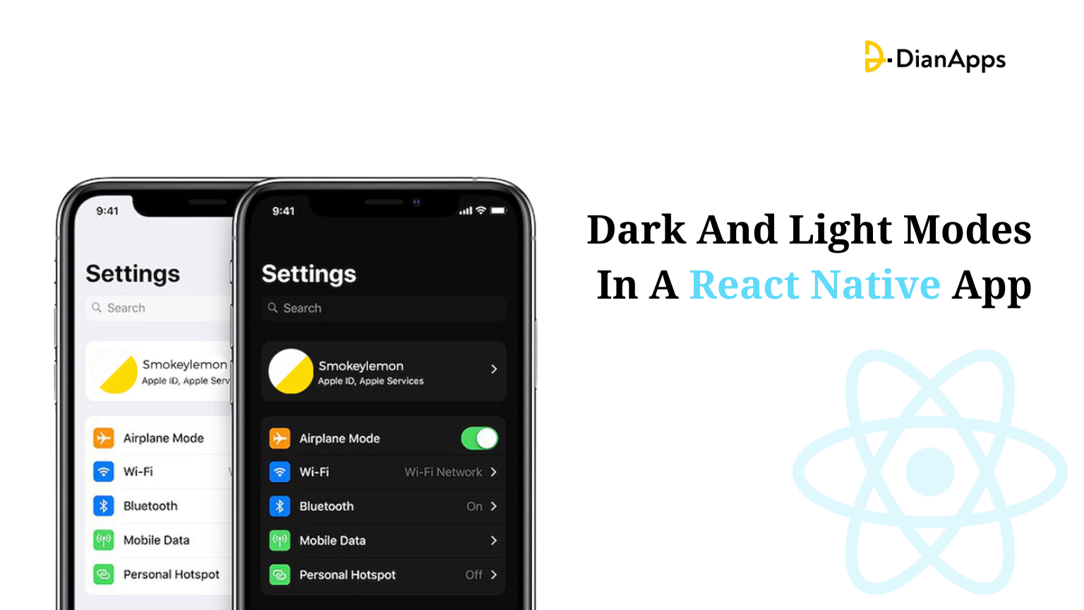
Modern apps require unique, customizable appearances that can match users’ preferences or suit their environment. Having a light and a dark mode in your app is becoming an everyday necessity for a pleasant user experience that allows you to read at ease while tuning the brightness of your mobile from low to highlight as per the need.
This blog is a straightforward guide to implementing dark and light modes in your business app using React Native as our core app development framework.
From discussing the fundamental concepts behind dark and light modes to overviewing various techniques and best practices for incorporating them into your React Native projects, you will get all the knowledge and tools necessary to integrate dark and light modes in your React Native app development, providing your users with a visually pleasing and customizable experience.
Let’s dive in and explore the exciting world of theme customization in React Native!
Fundamental Concepts Behind Dark and Light Modes in a React Native App
The idea behind React Native’s Dark and Light modes is to give consumers a selection of several color schemes to improve their app experience.
Understanding these modes’ significance, taking user experience into account, ensuring accessibility, and keeping design coherence are the essential ideas driving their implementation.
The Significance of Dark and Light Modes:
Because of all the advantages they offer, dark and light modes have become extremely popular.
Dark mode, which has a muted color palette, is known to ease eye strain, especially in dimly lit areas, preserve battery life on devices with OLED panels, and have a sleek, contemporary appearance.
The conventional, bright, and lively appearance of Light mode, on the other hand, may be preferred by some users or more appropriate in specific situations.
You can accommodate a larger range of user preferences and improve the overall usability of your React Native app development services by combining the two modes.
Considerations for User Experience:
When integrating Dark and Light modes, it’s critical to take the user experience into account.
A smooth change between modes guarantees a consistent and understandable app experience.
There shouldn’t be any interruptions or issues when users switch between modes. The legibility of text, contrast ratios, and overall visual hierarchy must all be carefully considered in all modes.
Additionally, taking user preferences into account and providing a simple method to switch between modes can significantly improve user happiness.
Accessibility:
When implementing Dark and Light modes, accessibility is a essential factor.
Due to the possibility that certain users may suffer from visual impairments or conditions like photophobia, it is essential to make sure that both modes provide enough contrast and readability.
The light mode should maintain a balance between brightness and readability, while the dark mode should avoid utilizing color combinations that tax the eyes or make it difficult to see text.
Everyone can benefit from a positive user experience provided accessibility standards are followed and rigorous testing is done with various user profiles.
Design Consistency:
To deliver a smooth app experience, maintaining design consistency between Dark and Light modes is essential.
Regardless of the mode chosen, the essential functionality, layout, and branding components should remain constant. It is essential to retain the intended appearance and usability of icons, buttons, and other UI components.
Furthermore, maintaining a strong visual identity for your app throughout various modes can be accomplished by using consistent typeface, spacing, and color palettes.
You may create a strong basis for implementing Dark and Light modes in your React Native app by comprehending these basic ideas.
This information will help you design an application that is aesthetically pleasing, easily navigable, and user-friendly, caters to a variety of user preferences, and improves the user experience as a whole.
Techniques and Best Practices For Incorporating Dark and Light Modes in React Native App
There are a number of strategies and best practices you can use to develop a Dark and Light theme in a React Native app with ease. Let’s examine a few of these methods and recommendations:
Using Device Settings:
Leveraging the user’s device settings is a simple strategy. Through the Appearance API, React Native gives users access to the device’s preferred color scheme. You can dynamically adjust the user interface of your app by listening to changes in the appearance mode.
Use conditional rendering, for instance, to apply several styles dependent on the mode that is being used. By using this method, you may align your app with the user’s preferred mode without needing to ask the user to make any further configurations.
Custom Theme Management:
You can have additional control over the Dark and Light modes in your app by implementing a custom theme management system. For each mode, you can specify a separate set of color schemes, typography, and other style elements.
React-native-paper, a well-liked package for managing themes in React Native, includes built-in support for Dark and Light modes. You can quickly transition between themes using custom theme management, and you can even provide consumers with more customization options for their chosen mode.
Component Styling With Dynamic Styles:
You may use dynamic styles to give your React Native components Dark and Light modes. You can dynamically adjust the appearance of your UI elements by encapsulating styles within functions or objects that react to the active mode.
Depending on the active mode, you can use this technique to provide various colors, font sizes, and other style attributes. It guarantees a unified and aesthetically pleasing experience in both Dark and Light modes.
Considering Contrast and Legibility:
To ensure readability and accessibility in Dark and Light modes, maintaining sufficient contrast and legibility is essential. While Light mode should use dark text on a light backdrop, Dark mode should use light text on a dark background.
Make sure that text, icons, and other UI elements can be clearly distinguished by paying attention to contrast ratios. To ensure that the color combinations you’ve picked adhere to accessibility guidelines, you can utilize tools like the WCAG (Web Content Accessibility Guidelines) contrast ratio calculator.
Testing and User Feedback:
To find any potential visual or functional issues, thoroughly test your app in both Dark and Light modes. To ensure uniform behavior, test on several devices with varying screen kinds and sizes. Additionally, get input from people with various preferences and accessibility requirements.
Their feedback can assist you in honing your implementation and making the necessary modifications to enhance the user experience as a whole.
Let’s now get started with setting up the React Native configuration.
React Native Setup Configuration
For any developers who are beginning to use this cross-platform app development framework, this is the most essential stage.
Nevertheless, if you have experience developing React Native projects, you must be aware of the importance of this setup procedure.
My main goal is to help newcomers set up their React Native environments.
Install VS Code, NodeJS, and Android Studio for your system’s environment configuration. You can also take into account various code editors that you prefer. The Visual Code editor, however, is the most suggested code editor or IDE. The paths for the Java and Android SDKs must also be created in the Environment Variables section.
Keep in mind that you need to use Android Studio’s most recent version. A newer version, such as Marshmallow (Android 6.0 SDK), is also an option.
Think about using Node Version Manager for Windows when installing NodeJS.
Check out the relevant article for detailed instructions.
The iOS platform is not our main emphasis in this article; only the Android platform is. The installation procedure will differ for the iOS platform.
Creating a simple template
You require a fundamental project to which you can add the codebase tailored to your requirements. So let’s find out how to create this template.
- Make a brand-new folder, perhaps on your C drive.
- Run npx react-native init Light_dark –version 0.68.1 in the folder’s terminal or command prompt to start the native react framework. Type “Enter”
- So, your C drive’s “Light_dark” template is produced.
We have used the React Native version 0.68.1 in this instance. However, if you want to know the latest 0.72 version of React Native, keep reading here
We will now proceed with the codebase since the prerequisite setup procedure is complete.
Code Setup for the Dark & Light Mode Theme Integration
The user can choose between dark and bright themes in this straightforward Login-based software.
No more files need to be made. To begin altering the code, open the code editor from your “Light_dark” template and navigate to the App.js file.
Check out the GitHub repository for the complete project as well.
Importing Relevant Components
|
1 2 3 4 5 |
import { StyleSheet, Text, View,useColorScheme,Switch,TextInput } from 'react-native' import React,{useState} from 'react' |
As you can see, the code imports the react-native library’s Stylesheet, Text, View, useColorSheme, Switch, and Textinput.
The react library’s useState and React are also imported.
The hooks in this case are useState and useColorScheme.
Color schemes are offered through useColorScheme. The color schemes “dark”, “light”, and “null” are supported. To update the change in the display theme, useColorScheme, and useState hook are applied.
Here, the UI of the app is built using StyleSheet, View, Text, TextInput, and Switch.
Introducing the Dark Mode
|
1 2 3 |
const App = () => { const DarkMode=useColorScheme()=='dark'; |
With this code, a React component App is created. To determine if the user has chosen dark mode or not, it makes use of the hook useColorScheme.
The backdrop color of the View component changes to black if the user has chosen dark mode; otherwise, it stays white.
Taking Use of useState for the State Variable
dark, setDark] const = useState(darkMode)
This code creates the state variable dark in a React Native component lifecycle using the useState hook. The “DarkMode” setting is the default value for the variable dark.
The second component of this array is the setDark variable. It serves as a function to update the “dark” state variable’s value.
Rendering the App View, a Switch, and a Text Element
|
1 2 3 4 5 6 7 8 9 10 11 12 13 14 15 16 17 |
return ( <View style={{ flex:1, backgroundColor:dark?'black':'white', alignItems:'center', justifyContent:'center'}}> <Switch value={dark} onValueChange={(val)=>setDark(val)}/> <View> <Text style= {{color:dark?'#ffffff':'black',fontSize:22,alignSelf:'center'}}>Login</Text> |
A switch and the view renders by the code.
Toggle between dark and light modes using the switch.
The component’s background color is set to either black or white based on the value of the dark variable, and the view’s flex property is set to one.
The properties are justifyContent and alignItems are both set to center.
The user can go from light to dark mode by clicking a button that adds up to the screen. The switch’s value is set to the variable “dark” in the code, and when the switch is clicked, the function “setDark” is called with the switch’s new value as an argument.
Using TextInput to Add Placeholder Property
|
1 2 3 4 5 6 7 8 9 10 11 12 13 |
<TextInput placeholder='Email' style={{ width:340, height:40, borderWidth:1, borderColor:dark?'#ffffff':'black', marginHorizontal:30, marginTop:20}} placeholderTextColor= {dark?'#ffffff':'#454545'}/> |
A text input area for an email address adds to this code. The field is 340 pixels wide, 40 pixels tall, and 1 pixel wide at the boundary. If the variable dark is true, the border is white; if it is false, it is black. On the left and right edges of the field, there is a margin of 30; the top has a margin of 20.
If the display mode is dark, the text color of the placeholder “Email” is white, and if it is white, the placeholder text is color with the code #454545 (about Charcoal color).
|
1 2 3 4 5 6 7 8 9 10 11 12 13 14 15 16 17 18 19 |
<TextInput placeholder='Password' style={{ width:340, height:40, borderWidth:1, borderColor:dark?'#ffffff':'black', marginHorizontal:30, marginTop:20 }} placeholderTextColor={dark?'#ffffff':'#454545'} /> |
Another text input area for the password adds to this code.
The second text input field has an identical design to the first text input field; the only distinction is that the placeholder text in this field is “Password.”
Exporting the Main Component
|
1 2 3 4 5 6 7 8 9 |
</View> </View> ) } export default App |
In this case, we must close the View tag before exporting the App. You can use the codebase included in this App.js file to another file within this project by doing this.
Developing StyleSheet Object
|
1 2 3 4 5 6 7 8 9 10 11 12 13 14 15 16 17 |
const styles = StyleSheet.create({ loginText:{ color:'#000000', fontSize:22, alignSelf:'center', marginTop:20 },TextInput:{ } }) |
It has two style objects, loginText and TextInput, as you can see from the code syntax. The four properties of the loginText style object are color, fontSize, alignSelf, and marginTop. There is no content in the TextInput style object.
Also read the best practices for styling in React Native to better understand the style object functionality.
Time to reveal how the executed codebase works!
Implement the Codebase in the React Native App
After building the codebase, you must verify the program’s accuracy. Therefore, you must use a device to run the application (either a genuine device or an emulator). We’ll demonstrate how to use an emulator to run the application.
- Open the Command window by using the template folder.
- On the cmd, type npm install.
- Additionally, after passing the npm install, pass npx react-native run-android on the same command.
The emulator will launch as a result after bundling.

Look at the image GIF to see the result. It functions on the emulator successfully. By clicking the switch, users can quickly convert between the light and dark modes.
Final Thoughts
Implementing dark mode and light mode in a React Native app involves defining color schemes, detecting and switching between modes, adapting component styles, handling mode changes, and conducting comprehensive testing.
By following these steps, mobile app developers can provide users with the flexibility to customize their app’s appearance and improve the overall user experience.
Find a suitable React Native app development company to get started with implementing the dark and light modes in your app project right away!
 0 comments


Leave a Comment
Your email address will not be published. Required fields are marked *