What Are UI Icons and What Are They Used For?
Icons are tiny visual components or symbols used in user interface (UI) design that stand in for particular features, functions, or kinds of content in an interface. Instead of depending on interfaces with a lot of text, icons provide customers with quick, visual shortcuts to help them navigate and engage with a product.
The Purpose of Icons
The main goal of icons is to communicate meaning quickly. Icons can greatly accelerate understanding because the human brain processes pictures more quickly than text. In UI/UX Design Services icons play a crucial role in worldwide applications because of their universality, which enables users to comprehend information in any language. Selecting the appropriate metaphor is essential to good icon design since users will comprehend a symbol’s purpose more quickly if it is intuitive.
![]()
Consider the Spotify app as an example. It uses familiar icons such as the heart for saving songs and playlists and the speaker icon for controlling volume. These instantly recognizable visuals allow users to quickly identify and interact with the features they need.
Key Principles of Icon Design Every UI Designer Must Follow
Effective icon design involves more than simply aesthetics; it also involves developing a user-friendly and practical experience. The following seven fundamental ideas can help you design your icons:
1. Clarity of Meaning
The first rule is clarity; people should be able to tell what an icon means right away. This is particularly important when creating unusual or distinctive icons. Consider images or symbols that will resonate with your target audience. A straightforward musical note, for instance, is easier to understand than a complicated abstract symbol when creating an “audio player” icon for a music app.
2. Visual Clarity (or Readability)
Icons need to be readable and clear due to their small size. To keep icons from becoming difficult to understand, stay away from really intricate elements and make sure there is enough space between them. In UI design, visual clarity is just as important as typography or color selection.
3. Simplicity
Icons that are too intricate are frequently less effective than those that are simple. Users won’t have to work hard to decipher the icon’s message because of its simple style. A more complex representation of a play button could be misleading, but a basic one (triangle pointing to the right) is generally recognized.
4. Familiarity
Whenever feasible, stick to well-known and recognizable symbols. Users can quickly understand icons such as the magnifying glass for search, the envelope for communications, or the home house. Using well-known icons in design makes the user experience intuitive and less taxing on the brain.
For example, the Uber app uses a simple car icon to represent a ride. This icon is universally understood and immediately conveys the action, eliminating any need for additional explanation.
5. Alignment and Balance
Precise attention to detail is necessary for icon design, particularly regarding balance and alignment. Make sure every icon is positioned correctly and has a pleasing visual balance. For instance, all of Apple’s icons, whether they be toolbar or app icons, have a constant alignment that makes them visually appealing and easy to grasp.
6. Consistency Across the Board
In an icon system, consistency is essential. To ensure consistency in size, weight, and color, all icons should adhere to the same visual guidelines. This strengthens the visual identity of the product and brings coherence to the interface. It is always better to create a good brand guideline in the initial phase of design.
The Secret Sauce: How a Style Guide Elevates UI/UX Design
For example, Airbnb uses icons across their platform that vary in shape, but they adhere to the same visual family, ensuring that each icon feels like part of a cohesive design system.
7. Personality and Branding
In addition to being useful, icons also help to convey the personality of the product and make it consistent with its brand. The brand’s identity can be strengthened by using colors, forms, and styles creatively. For example, Slack’s vibrant and lively symbols complement its approachable, amiable brand, making the interface both useful and entertaining.
What to Consider When Using Icons in UI
Choose well-designed, communicative icons for your UI design. Icons are essential to all UI/UX designs, especially minimalist designs, where they can convey meaning without adding visual clutter.
A Guide of Modern Minimalism in UX Design
Recognition
Icons can either be abstract or representative:
- Abstract Icons: These are simple shapes and symbols that rely on learned recognition (e.g., the hamburger menu used by Twitter).
![]()
Icons that are abstract; Icons in use: Core Line
Representative Icons: These resemble real-world objects and are easier to understand without prior exposure (e.g., an envelope for Gmail messages).
![]()
Icons that are representative of real-world objects; Icons in use: Core Line
Accessibility
Important information should never be communicated just through icons. To ensure that visually challenged users can comprehend the purpose of each icon, always provide alt text or screen reader labels. Labels should be brief but informative.
For example, LinkedIn uses tooltips with its icons to ensure users know exactly what action they’ll trigger when interacting with an icon.
![]()
Labels and tooltips are added against icons to help with accessibility; Icon in use: Core Line
Sizing
Consistent icon sizing is key for a polished interface. Small icons typically range from 16px, medium icons are 24px, and larger icons may be up to 32px. Ensure icons align with text baselines for a consistent and balanced design.
Some tips on sizing icons:
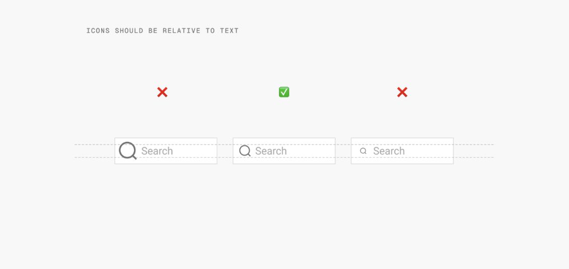
Icons and texts should be at the same baseline; Icon in use: Sharp Line
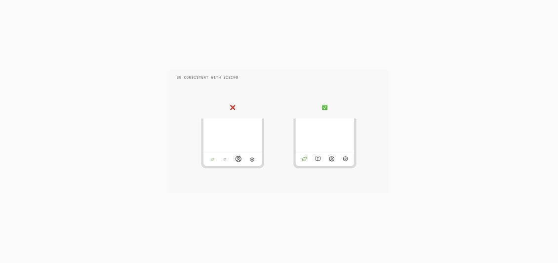
Spacing
Adequate padding and spacing around icons are necessary for usability. Icons shouldn’t be placed too near other interactive elements or crowded together. To guarantee ease of interaction, particularly on mobile devices, WCAG rules recommend that touch targets surrounding icons be at least 48 × 48 pixels.
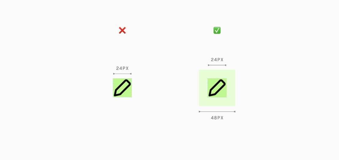
Each symbol in the navigation bar of the Instagram app, for instance, is evenly spaced, making it simple to tap without accidentally clicking.
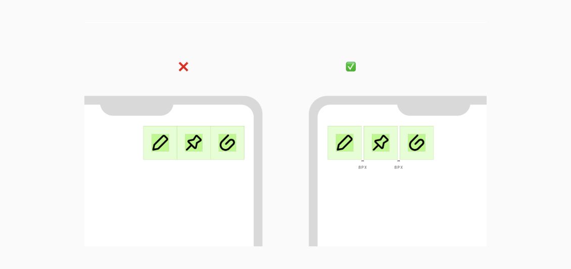
Similarly, don’t place icons too close together. There should be spacing between icons for visual separation and ease of tapping on the touch targets. Adjacent icons without padding may appear cluttered and hard to parse.
Alignment
For a neat, structured appearance, make sure the icons line up with the surrounding text and other components. Your interface’s overall usefulness and appearance are greatly influenced by alignment.

For instance, Google’s Material Design standards place a strong emphasis on labels and icons aligning consistently, which makes the user interface more ordered and aesthetically pleasing.

Line alignment of icons and text creates a clean, organized look
Align icons based on their text alignment to achieve visual balance
Make sure icon and text baselines match
Why Should You Use Icons in Your Interface?
Visual Communication
Icons convey information fast and effectively, enabling consumers to rapidly grasp functionality. For example, users can quickly locate the search function without any text by using the Spotify search icon.
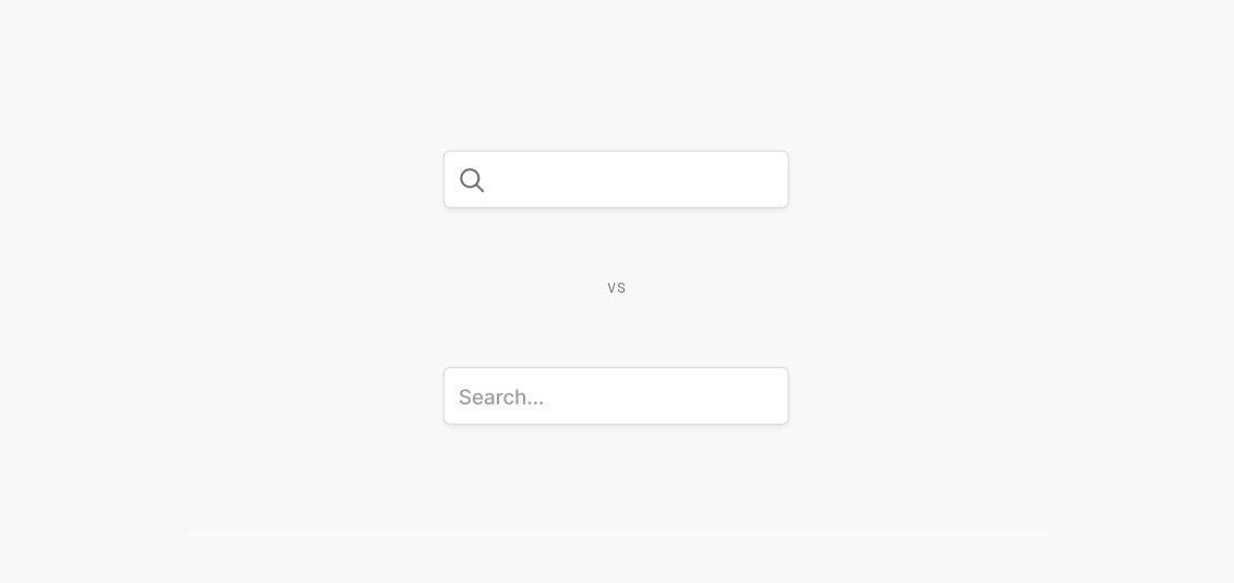
Search icon (Nova by Streamline) helps in visually communicating a search bar (top)
Universal Symbols
Icons are a universal form of communication that cuts across linguistic boundaries. For instance, whether you’re using Google Drive in Japan or Dropbox in the US, the download icon is widely recognized.

Download button in English (top) and Japanese (bottom); Icon used: Sharp Line by Streamline
Brand Cohesion
Icons provide a product with a recognizable visual language, which helps with branding. The brand’s identity is strengthened by consistent imagery, which increases user loyalty and awareness. For instance, Airbnb and Ikea, feature bold yet basic icons that complement their powerful athletic brand.
Answer: Ikea (top), Airbnb (bottom)
Accessibility
Interfaces featuring icons can be easier for people with disabilities to utilize. Icons may be simpler for those with dyslexia or visual impairments to recognize than words. For individuals with visual impairments, using high-contrast icons can help increase visibility.
Microsoft, for instance, makes titsinterface accessible to people with visual impairments by using high-contrast icons.
Users with disability recognize icons over words and high contrast helps in visibility
Scannability and Speed
Icons highlight important features on interfaces, allowing users to scan them more quickly. Because they are visual, users can recognize activities or material more quickly, which speeds up navigation and eliminates the need for lengthy descriptions.
For example, the WhatsApp app’s icon-based navigation makes it easy for users to discern between calls, chats, and status updates.
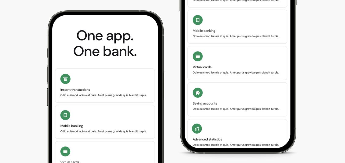
Micro Solid icons for easy scannability during a banking app onboarding
Designing Icons in Figma
Figma offers powerful tools for creating and managing icon systems. Here’s how you can design and manage icons efficiently:
Importing Icons from Libraries
Use the Streamline Plugin to import icons into your Figma file. You can customize vector icons by resizing, changing colors, or adjusting strokes.
Using Components
Once you create a component, you can easily drop icons from the asset panel into your design, making it easy to swap and maintain consistency.
Creating Icon Variants
Design different variants (outlined, filled, colored) of icons to suit different states and contexts. Using components for these variants allows for easy swapping and ensures consistency.
Auto-layout for Responsive Design
Ensure icons resize proportionally across different screen sizes by using Figma’s auto-layout feature. Set constraints to maintain consistent icon sizes within different contexts.
Conclusion
Icons are vital in UI design, offering clarity, simplicity, and quick recognition for users. By following key principles—like consistency and visual clarity—icons can improve usability, enhance accessibility, and reinforce branding. Whether for mobile apps or websites, well-designed icons streamline interactions and elevate the user experience, making them an indispensable part of any interface.
Get your product from the best Software Development Company to get the best UI/UX design services and make it stand out in the market.


Leave a Comment
Your email address will not be published. Required fields are marked *