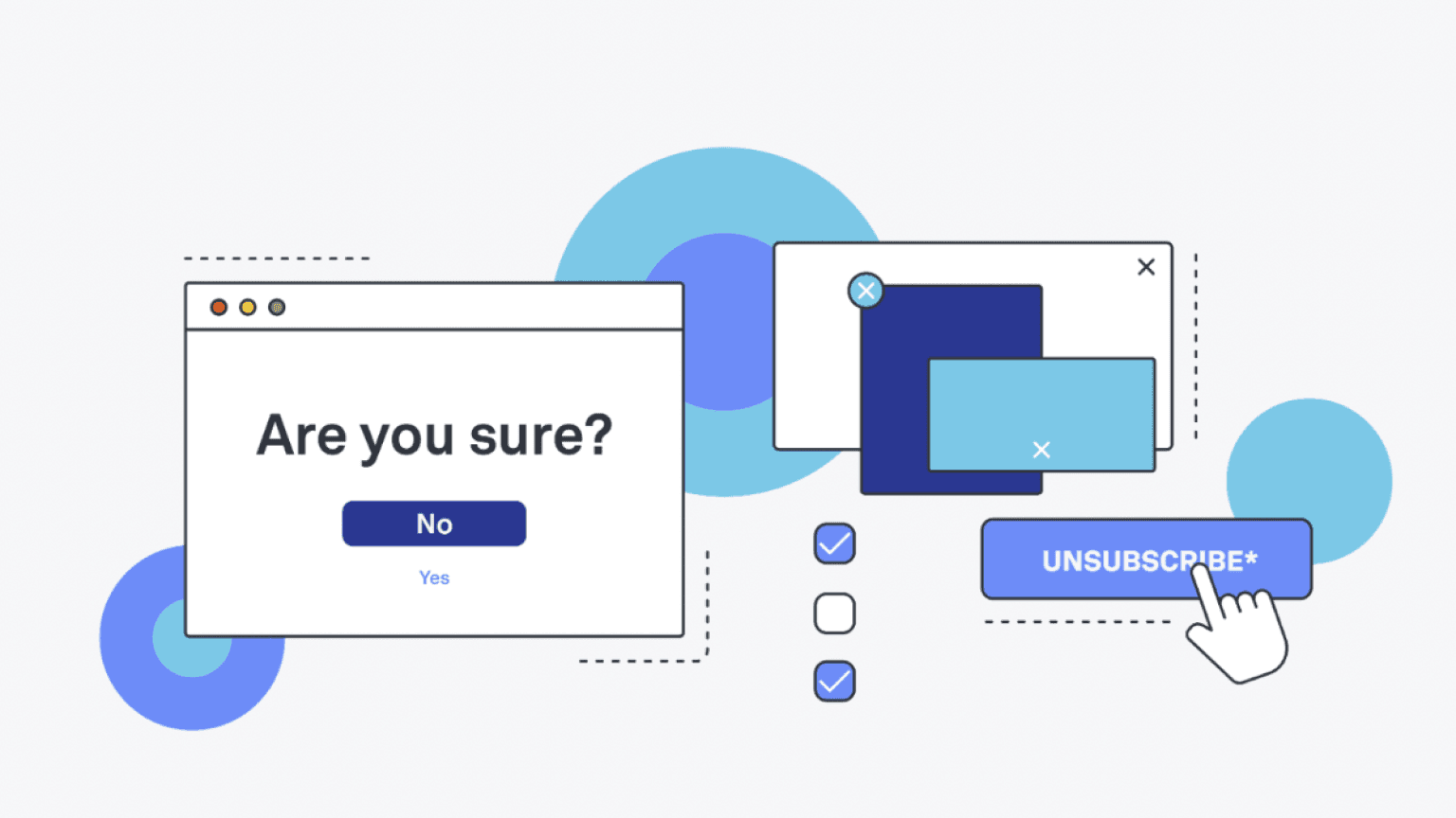
Design is often used to trick users into doing things which they do not want to do. These manipulative design techniques are the dark side of UI/UX design services often known as dark patterns.

Why dark patterns?
Dark patterns initially help businesses to grow. They use psychology to manipulate users into doing stuff that benefits the company resulting in increased sales, user base, subscriptions and eventually, more profit but mostly these are short-lived.

Some common types of dark patterns include:
Misdirection
Misdirection is created by diverting a user’s attention away from the intended action through subtle distractions so that they do not notice something else that is happening.The placement if elements will be done in certain way that user’s focus will stay on the parts where the business wants them to look at, missing to check what else is coming along.
One example is the upgrade of Skype software. Every designer knows that users don’t usually read everything and found an opportunity to sneakily make Bing the default browser along with the update.
Forced continuity
Forced Continuity is one of the dark patterns practices in which the user signs up for a free trial but they are asked to enter their credit card details while doing so at the very beginning of the free trial subscription process. They start to get charged once the trial period is over. The users often do not receive any message prior to deduction of amount. Dark patterns like this make it difficult for users to cancel or opt out, often resulting in unexpected charges and frustration.

Roach motel
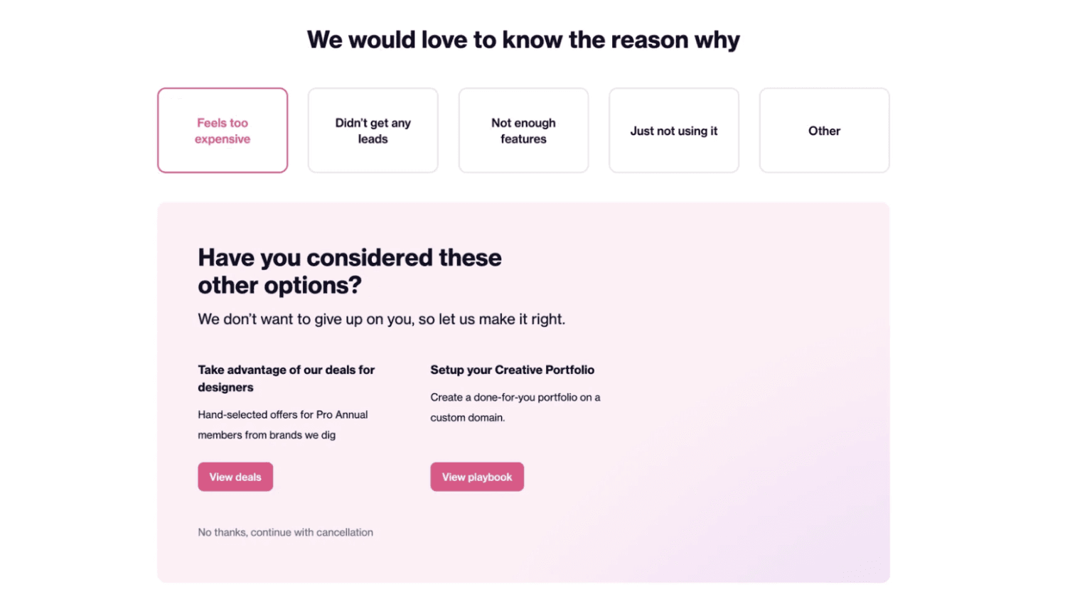
Similar to forced continuity, the roach motel strategy makes it easy for users to enter a situation but incredibly difficult for them to leave. They can easily subscribe but cancelling the subscription is often a very tough and frustrating process. The option to unsubscribe is hidden or other offers are shown to make the user extend the subscription.

Sneak into basket
You must have encountered this when you added an item to your online shopping cart and additional items are mysteriously included at the time of checkout. This tactic is known as “sneak into basket”. It preys on user’s inattention, leading to unintended purchases.
Disguised ads
Disguised ads look like the content on the rest of a site, making users more likely to click on them.

This example shows the actual download at the top but then there is another download option which is disguised as a part of the page encouraging users to click on every download they see on screen.
Fake urgency
Fake urgency is yet another manipulative technique which is used to create a sense of pressure to encourage user to make a quick decision without spending time on thinking about if they want or need to purchase this or not. Sometimes, they are also not made aware of the consequences.
Various examples of fake urgency are :
Countdown timers: Displaying a timer to show that a particular offer is ending very soon often pressurize the users to buy it quickly.

Limited stocks notification: Showing a product is high in demand and will quickly be sold out is another way of creating fake urgency among users.Users feel that if they won’t purchase right now, the product will go out of stock.

False or ambiguous deadlines: Not showing when an offer is ending or showing a false deadline so that user can rush to make a purchase is also a dark pattern trying to create urgency. User will not be able to see when an offer is ending and hence will end up purchasing the product quickly to not miss out on the discount.

Why should dark patterns be avoided?
Platforms using dark patterns lose the trust of users because of these ill-practices. Initially, it might seem tempting to employ dark patterns to boost user engagement and boost sales and subscriptions but in the long run, resorting to these manipulative tactics will ultimately erode customer trust leading to the diminishing of the overall size of your user community. These users will never be able to trust that business ever again which will cause a permanent loss of user base.
Is there a possible solution?
As designers and consumers, it’s crucial to recognize and combat dark patterns in UX design. There can be times when clients may think they can increase customer retention and make more profits by making it tough for the users to cancel their subscriptions or services. In this scenario, it is the designer’s responsibility to push back and explain that this tactic will lead to frustration among the users. Designers must prioritise ethical practices and user-centric design principles, ensuring that every interaction respects the well-being of the user.
On the other hand, consumers should also pay more attention and should always question suspicious design elements
Conclusion
We know that companies want to make money and there is nothing wrong with that. But it should not be done at the cost of users by tricking them. As a designer, the goal should always be to provide a positive user experience to users. By adapting to ethical design practices, we can create digital experiences that empower, rather than exploit the users they serve. After all, in UX design, transparency and trust are the principles of a truly exceptional user experience.


Leave a Comment
Your email address will not be published. Required fields are marked *