In the current era, where attention spans are short and competition is fierce, landing pages have become indispensable tool for organizations, industry leaders, and marketers.
Whether you’re looking to generate leads, sell a product, promote an event, or simply capture user information, a well-designed and optimized landing page can make all the difference in converting visitors into long-term customers.
Now what’s exactly a landing page? It is a standalone web page specifically created with a focused objective in mind. It serves as a gateway for users who click on an ad, email campaign, or search result, guiding them toward a specific action or conversion.
Unlike traditional web pages, landing pages are laser-focused and designed to eliminate distractions, directing visitors towards a single call-to-action (CTA) and capturing their attention immediately.
The importance of landing pages in digital marketing cannot be overstated!
Also read: Why website development is profitable and important for business?
They act as virtual sales representatives, providing a tailored experience for each visitor and increasing the likelihood of achieving your marketing goals.
This comprehensive guide will explore the key elements of an effective landing page, delve into design and layout considerations, discuss optimization techniques, and highlight best practices to ensure your landing pages deliver exceptional results.
We will also touch on tracking and analyzing performance metrics, and common mistakes to avoid, and provide real-world examples of successful landing pages for your website development services.
By the end of this guide, you will have the knowledge and tools necessary to create compelling landing pages that engage, convert, and drive your desired outcomes.
So let’s dive in and discover the art and science of crafting a landing page that truly shines.
Key Elements of an Effective Landing Page

To create an effective landing page that achieves its desired objectives, certain key elements must be carefully crafted and strategically placed. These elements work together to captivate the visitor’s attention, communicate the value proposition, and guide them toward taking the desired action. Let’s explore these elements in detail:
A. Clear and Compelling Headline:
The headline is the first thing visitors see when they land on your page. It should be concise, attention-grabbing, and convey the primary benefit or offer. A compelling headline sets the tone for the rest of the page and entices visitors to continue reading.
B. Engaging Subheadline:
The subheadline provides additional context and elaborates on the headline, reinforcing the value proposition and capturing the visitor’s interest. It should be concise, and persuasive, and encourage visitors to explore further.
C. Convincing & Effective Copy:
The copy on your landing page should be focused on the benefits or solutions your product or service offers. It should highlight the unique selling points, address pain points, and communicate the value to the visitor. Use bullet points, bold text, and subheadings to make the copy scannable and easy to read.
D. Eye-catching Images or Visuals:
Visual designs play a very important role in user engagement, therefore, you must include high-quality images, videos, or graphics to enhance and entice your landing page. Make use of visuals that are relevant to your offering and help convey the message efficiently. To enhance the quality of your video content, use a proficient video editor, implementing transitions, effects, filters, and text boxes strategically to align visuals with your message. Visuals should be optimized for fast loading times and should not overpower or distract from the main content.
E. Call-to-Action (CTA) Button:
The CTA button is the ultimate goal of your landing page. It should stand out visually and have clear, action-oriented text. Use contrasting colors and design techniques that draw attention to the button. Place the CTA button strategically on the page, ensuring it is easily accessible and visible without requiring excessive scrolling.
F. Trust Indicators:
Trust indicators help build credibility and instill confidence in visitors. Include elements such as customer testimonials, reviews, security badges, industry affiliations, or any other trust-building factors relevant to your offering. These indicators can alleviate any concerns visitors may have and increase their likelihood of converting.
G. Social Proof:
Social proof leverages the influence of others to persuade visitors. Displaying social proof elements such as customer success stories, case studies, endorsements, or the number of satisfied customers can establish trust and reinforce the value of your product or service.
H. Form or Data Capture:
If your objective is to collect visitor information, a form should be included on the landing page. Keep the form simple and concise, asking for only essential information. Strike a balance between collecting valuable data and not overwhelming visitors with a lengthy form.
With this, we have gathered all the information about the key elements required to indulge in an effective landing page. It’s time to know what designs and layouts to consider while creating your first-ever web app development landing page.
Design and Layout Considerations
What’s the catch for your competitor’s reach and recognition when you are doing the same effort as they are? Have a similar question in mind? Well, they have a rich design interface that compelled users to choose them over you!
A well-thought-out design and layout not only enhance the overall user experience but also contribute to higher engagement and conversion rates. Consider the following design and layout considerations when crafting your landing page:
A. Clean and Minimalist Design:
Opt for a clean and clutter-free design that focuses attention on the key elements of your page. Avoid unnecessary distractions, excessive text, or visual elements that may confuse or overwhelm visitors. A minimalist design helps create a visually pleasing and streamlined experience.
B. Consistent Branding and Visuals:
Maintain consistent branding across your landing page to create a cohesive experience for visitors. Use your brand colors, fonts, and logo consistently throughout the page. create a logo with the help of logo maker. Consistent branding helps reinforce brand recognition and builds trust with your audience.
C. Mobile Responsiveness:
With the increasing use of mobile app development devices, it is essential to ensure that your landing page is fully responsive and optimized for mobile viewing. Test your landing page on various screen sizes and devices to ensure a seamless experience for mobile users.
D. Intuitive Navigation:
Keep the navigation on your landing page simple and intuitive. Visitors should be able to find what they are looking for easily and navigate through the page without confusion. Stick to a single, clear conversion path that guides visitors toward your desired action.
E. Above-the-Fold Content:
In shaping visually captivating content for your landing pages, integrating personalized visual elements can significantly amplify user engagement. To effortlessly create and print your own collage that echoes the essence of your campaign, choosing the right tools is paramount. Leveraging a comprehensive photo collage maker allows for crafting unique visuals that align with your brand’s message, setting a distinctive tone that encourages visitors to take action.
F. Use of White Space:
White space, also known as negative space, refers to the space between elements on a page. Effective use of white space helps create visual breathing room, improves readability, and draws attention to key elements. Avoid overcrowding your landing page and allow important elements to stand out.
G. Readability and Typography:
Choose fonts and font sizes that are legible and easy to read. Use a combination of font styles to differentiate headings, subheadings, and body text. Explore AI generated fonts for projects requiring visual impact. Ensure there is sufficient contrast between the text and the background to enhance readability.
Remember, a well-designed landing page increases the likelihood of conversions and enhances the overall user experience. Therefore, you need to be very specific with your ideas and employ a website development company that can fulfill your expectations.
While these were our recommended considerations, a landing page must also involve some optimization techniques, in the next section, we’ll be covering that in detail. So, keep reading.
Landing Page Optimization Techniques
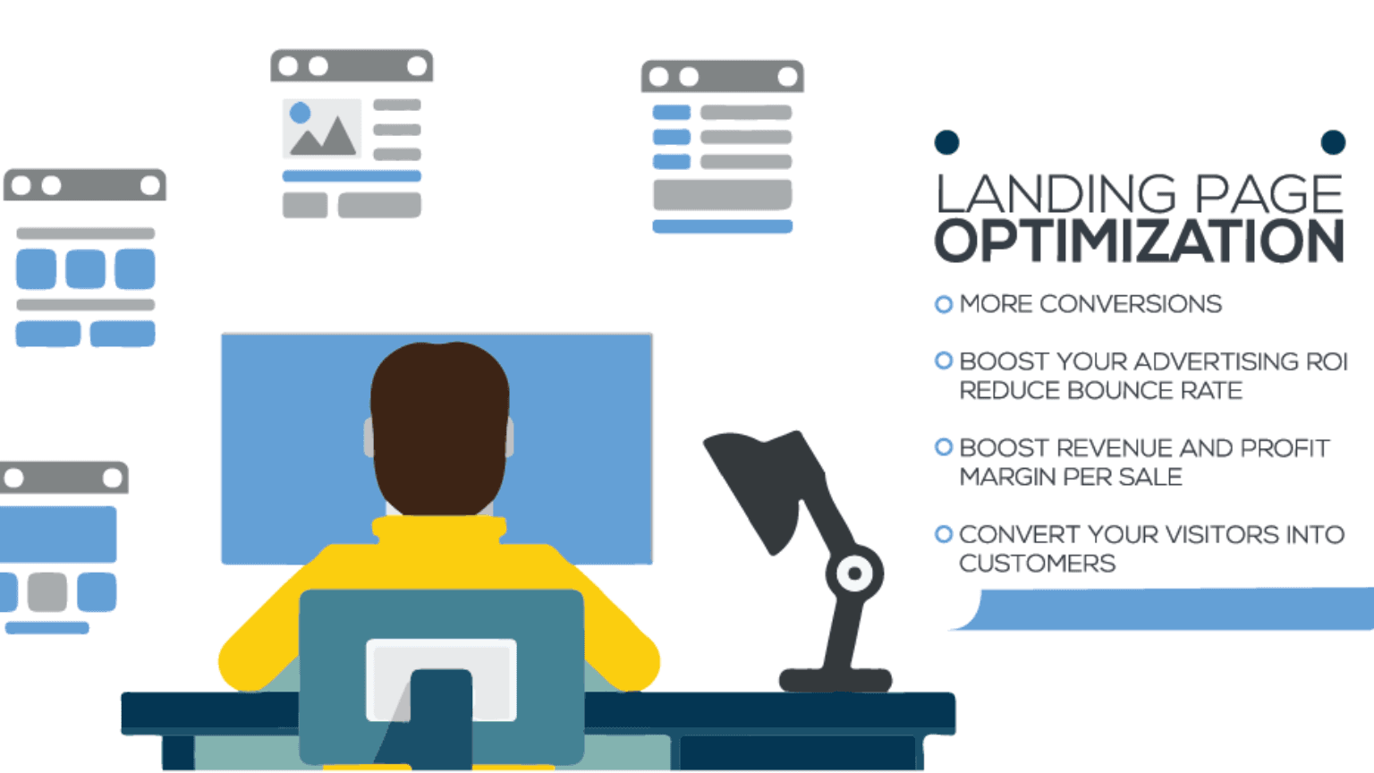
According to industry experts, by implementing various optimization techniques, businesses can refine their landing page to better resonate with the audience and draw beneficial results.
A. A/B Testing:
A/B testing, also known as split testing, involves creating multiple versions of your landing page and testing them against each other to determine which performs better. Test different elements such as headlines, copy, images, CTAs, form fields, or colors. Analyze the results and make data-driven decisions to optimize your page for better performance.
B. Conversion Rate Optimization (CRO):
Conversion rate optimization focuses on improving the percentage of visitors who take the desired action on your landing page. Through careful analysis of user behavior, testing, and optimization techniques, CRO aims to increase conversions. Test different variations, identify bottlenecks, and make iterative improvements to optimize your conversion rates.
C. Optimizing Load Times:
Slow-loading landing pages can lead to higher bounce rates and lower conversions. Optimize your landing page’s load times by minimizing image sizes, leveraging caching techniques, optimizing code, and choosing a reliable hosting provider. Fast load times contribute to a positive user experience and improve overall conversion rates.
D. Optimizing for SEO:
While landing pages are often used in paid advertising campaigns, optimizing them for search engines can drive organic traffic and improve visibility. Conduct keyword research to identify relevant keywords and incorporate them into your page’s meta tags, headings, and content. Ensure your landing page is well-optimized for search engines to attract organic traffic.
E. Personalization and Segmentation:
Tailor your landing page content and messaging to specific audience segments or customer personas. Personalization can significantly improve engagement and conversions. Use dynamic content or landing page variants that resonate with different segments of your audience, based on factors such as demographics, location, or previous interactions.
F. Social Media Integration:
Integrate social media elements into your landing page to leverage the power of social proof and encourage social sharing. Include social media sharing buttons, customer testimonials from social platforms, or social media widgets to boost credibility and amplify the reach of your landing page.
By implementing these landing page optimization techniques, you can fine-tune your page for better performance, increase conversion rates, and achieve your marketing objectives. Remember to regularly analyze data, conduct tests, and make iterative improvements based on user behavior and feedback. Continual optimization is key to ensuring your landing page remains effective and aligned with your audience’s needs.
As this is our comprehensive guide to provide all that you need to get started with the organization’s landing page, we can’t miss on the best practices, can we?
Dive into it below!
Best Practices of Landing Pages
Optimization is good but having yourself the best practices in place can set a strong foundation for success. Consider the following best practices to create high-performing landing pages:
A. Clear and Specific Objective:
Define a clear and specific objective for your landing page. Whether it’s to generate leads, sell a product, or promote an event, a focused objective helps you create a targeted and compelling message.
B. Targeted Audience and Segmentation:
Identify your target audience and create a landing page that speaks directly to their needs, pain points, and desires. Segment your audience if necessary and create personalized landing page experiences for different segments.
C. Relevant and Valuable Content:
Ensure your landing page content is relevant, valuable, and aligned with the expectations set by your ads or promotional materials. Communicate the benefits and unique selling points of your offering to engage and persuade visitors.
D. Consistency with Ad or Email Campaign:
Maintain consistency between your landing page and the ad or email campaign that leads visitors to it. The messaging, design, and visuals should be cohesive, providing a seamless transition and reinforcing the value proposition.
E. Simplified Forms and Data Collection:
Keep your forms simple and only ask for essential information. Lengthy forms can deter visitors from completing the conversion. Use smart form fields or progressive profiling to collect additional data over time, as the relationship with the visitor develops.
F. Trustworthiness and Security:
Instill trust in visitors by displaying trust indicators such as security badges, privacy policies, customer testimonials, and social proof. Assure visitors that their information is secure and that they can trust your brand.
G. Testing and Continuous Improvement:
Regularly test and analyze different elements of your landing page, such as headlines, copy, CTAs, or form placements. Use data-driven insights to make informed decisions and continuously improve your landing page’s performance.
By following these best practices, you can create landing pages that effectively engage your target audience, inspire action, and yield optimal results. Remember to adapt and iterate based on user feedback and website development market trends to stay ahead of the curve.
So is it all for the landing page guide? Of course not! With the best practices in hand, there’s still the need to check whether your website is performing well or not. Hence, below we have shared a few tips on tracking and analyzing your landing page carefully.
Tracking and Analyzing Landing Pages Performance
To gauge the effectiveness of your landing page and make informed decisions for optimization, it’s essential to track and analyze its performance. By monitoring key metrics and using analytical tools, you can gain valuable insights into visitor behavior and identify areas for improvement. Consider the following tracking and analysis techniques:
A. Analytics and Metrics:
Set up web analytics tools like Usermaven or Google Analytics to track key metrics such as traffic, bounce rate, time on page, and conversion rates. Analyze these metrics regularly to gauge the performance of your landing page and identify areas that need attention.
B. Conversion Tracking:
Implement conversion tracking to measure the number of visitors who complete the desired action, such as form submissions, purchases, or sign-ups. This data helps you understand the conversion rate and the effectiveness of your page in achieving your goals.
C. Heatmaps and User Behavior Analysis:
Utilize tools that provide heatmaps and user behavior analysis to visualize how visitors interact with your landing page. Heatmaps reveal areas of high engagement and areas that are often ignored, allowing you to optimize the placement of important elements.
D. Split Testing Tools:
Take advantage of split testing tools that allow you to test different versions of your landing page simultaneously. By running A/B tests, you can compare performance metrics and determine which variations drive better results.
E. Google Analytics Integration:
Integrate Google Analytics with your landing page to access advanced tracking capabilities and gain deeper insights. Set up goals, track events, and leverage advanced segmentation to analyze the performance of specific segments or traffic sources.
By consistently tracking and analyzing landing page performance, you can identify strengths, weaknesses, and opportunities for improvement. Use data-driven insights to make informed decisions, refine your landing page, and continuously optimize for better results.
Remember that landing page performance is not static, and consumer behavior evolves. Regular monitoring and analysis will help you stay ahead of the curve, adapt to changing trends, and ensure that your landing pages remain effective in achieving your marketing objectives.
Common Mistakes to Avoid
Even when you become a pro in creating or managing your landing pages, you might encounter errors that you may not know how to tackle. Hence, it becomes extremely important to be aware of the common pitfalls and mistakes that can hinder its functioning.
A. Lack of Clarity and Focus:
Failing to communicate your value proposition and offer can confuse visitors and lead to high bounce rates. Ensure that your headline, subheadline, and copy convey the benefits and purpose of your landing page.
B. Complex and Lengthy Forms:
Requesting excessive information in your form can discourage visitors from completing it. Keep your forms simple, asking for only essential information. Only ask for additional details when necessary for further engagement or lead nurturing.
C. Poor Visual Hierarchy:
An ineffective visual hierarchy can make it difficult for visitors to navigate your landing page and find the desired information. Design your page with a clear visual hierarchy, emphasizing key elements and guiding visitors toward the primary call to action.
D. Slow Load Times:
Slow-loading landing pages can frustrate visitors and lead to higher bounce rates. Optimize your page for fast load times by optimizing images, minimizing code, and using reliable hosting. Aim for quick load times to provide a seamless user experience.
E. Inconsistent Messaging:
Inconsistency between your ad or promotional materials and your landing page can confuse visitors and create distrust. Ensure that the messaging, design, and visuals align with the expectations set by your ads or email campaigns.
F. Lack of Mobile Responsiveness:
Ignoring mobile responsiveness can lead to a poor user experience for visitors accessing your landing page on mobile devices. Optimize your landing page to be fully responsive, ensuring that it displays and functions correctly across various screen sizes and devices.
G. Overwhelming Design:
Overloading your landing page with excessive text, images, or graphics can overwhelm visitors and distract them from the main message. Keep your design clean, minimalist, and focused on the key elements that drive conversions.
By avoiding these common mistakes, you can create landing pages that effectively engage visitors and maximize your conversion rates. Regularly review your landing page, seek feedback from users, and conduct testing to identify and rectify any potential issues. Continual improvement is essential for achieving optimal results with your landing pages.
Finally, we have come to the end of this piece. But we can’t leave you with providing some awesome examples of landing pages that are jaw-dropping indeed.
Exclusive Examples of Landing Pages
To inspire your landing page designs and strategies, let’s explore some examples of effective landing pages across various categories:
A. E-commerce Landing Pages:
- Product Showcase: An e-commerce landing page that highlights a specific product with high-quality images, clear product descriptions, and a prominent call-to-action to make a purchase.
- Limited-Time Offer: A landing page that promotes a time-sensitive discount or sale, leveraging urgency and scarcity to encourage immediate action.
- Social Proof and Testimonials: An e-commerce landing page that incorporates customer reviews, testimonials, and ratings to build trust and credibility.
B. Lead Generation Landing Pages:
- Free Resource Offer: A landing page offering a valuable free resource, such as an ebook, whitepaper, or template, in exchange for visitors’ contact information.
- Webinar Registration: A landing page inviting visitors to register for an informative webinar, highlighting the benefits of attending and emphasizing the expertise of the presenters.
- Newsletter Subscription: A landing page that encourages visitors to subscribe to a newsletter or email list, emphasizing the value they will receive through exclusive content or special offers.
C. Event Registration Landing Pages:
- Conference or Trade Show: A landing page promoting a conference or trade show, providing key event details, a compelling agenda, and a seamless registration process.
- Charity or Fundraising Event: A landing page dedicated to promoting and accepting registrations for a charity or fundraising event, emphasizing the impact and importance of the cause.
- Virtual Event Experience: A landing page for a virtual event, highlighting the interactive features, networking opportunities, and engaging sessions that attendees can expect.
D. Webinar Landing Pages:
- Educational Webinar: A landing page promoting an educational webinar, clearly outlining the topics covered, the expertise of the presenter, and the key takeaways for attendees.
- Product Demo Webinar: A landing page focused on showcasing a product or service through a live demonstration webinar, highlighting the benefits, features, and real-life use cases.
- Q&A or Panel Discussion: A landing page for a panel discussion or Q&A webinar, featuring industry experts and inviting attendees to submit their questions in advance, generating anticipation and engagement.
These examples demonstrate the effective use of design elements, compelling messaging, and persuasive calls to action to engage visitors and drive desired actions. While considering these examples, remember to adapt them to fit your specific goals, target audience, and industry. Analyze successful landing pages in your niche and learn from their strategies to create landing pages that resonate with your audience and achieve optimal results.
Recapping the Landing Page Guide for You
In this comprehensive guide to creating landing pages, we covered everything required to get started with the web app development of your business product. Make sure you read all the details carefully to make the fullest of this blog.
And we are sure you must also have a question about where to find the top-notch website development company that can take up your project can build a like-minded website for your business. We are not letting you waste time on that!
DianApps is an all-around website development company in USA & Australia and has built a lot many satisfactory web apps for its clients. Visit us today and launch your landing page gracefully.








Leave a Comment
Your email address will not be published. Required fields are marked *