Have you ever noticed a popup that appears on the screen, catching your attention toward necessary information or directing you to the next step of the process?
The popup that is displayed is known as ‘Modal’ – A React Native component.
Modal is an integral part of modern application development. Modals come in very handy whether you want to display an error message or a success message. It even improves user interfaces.
If you are new to React Native and seeking to implement a modal in your mobile app development project, then you are at the right place!
This blog covers all the basics of React Native Modal and its various types along with examples.
So, let’s get started!
What is a Modal in React Native?
The React Native Modal is a View component that is used in displaying the content above an enclosing view on the screen.
Simply put, Modal is a screen that overlays the app content to provide important information or prompt the user for a decision.
There are 3 different types of animations to display the popup controlled by the ‘animationType’ prop:
- Fade: It fades into the view
- Slide: This slides from the bottom
- None: In this, the popup appears without any animation.
Add to that, to use Modal components in an application, you need to import Modal from the react-native component library.
Since these modals are purposely interruptive make sure you use them only when necessary.
Syntax:
| 1 2 3 4 5 6 7 8 9 10 11 | <Modal animationType="" transparent={} visible={} onRequestClose={} > |
Features of a Modal
- Smooth enter/exit animations
- Plain simple and flexible APIs
- Customizable backdrop opacity, timing, and color
- Listeners for the modal animations ending
- Resize itself correctly on device rotation
- Swipeable
- Scrollable
Modal Props
1. animationType:
Controls how the modal transitions in and out.
2. animated:
Used to enable or disable animations for the modal.
Note: This prop is outdated; use animationType instead.
3. hardwareAccelerated:
For Android devices only. Forces hardware acceleration for better performance.
4. onDismiss:
For iOS devices only. Takes a function that is called after the modal has been dismissed.
5. onOrientationChange:
For iOS devices only. Invoked when the device orientation changes while the modal is displayed.
6. visible:
Determines if the modal is currently showing on the screen or hidden.
7. onRequestClose:
This is called when the user taps the hardware back button on Android.
8. onShow:
This takes a function that is called once the modal has been shown.
9. presentationStyle:
For iOS devices only. Controls the appearance style of the modal.
10. statusBarTranslucent:
Determines whether the modal should go under the system status bar.
11. supportedOrientations:
For iOS devices only. Specifies the allowed orientations for the modal to be rotated.
12. transparent:
Decides if the modal fully covers the screen or has a see-through background
Other Types of Modals in React Native
1. Modalize
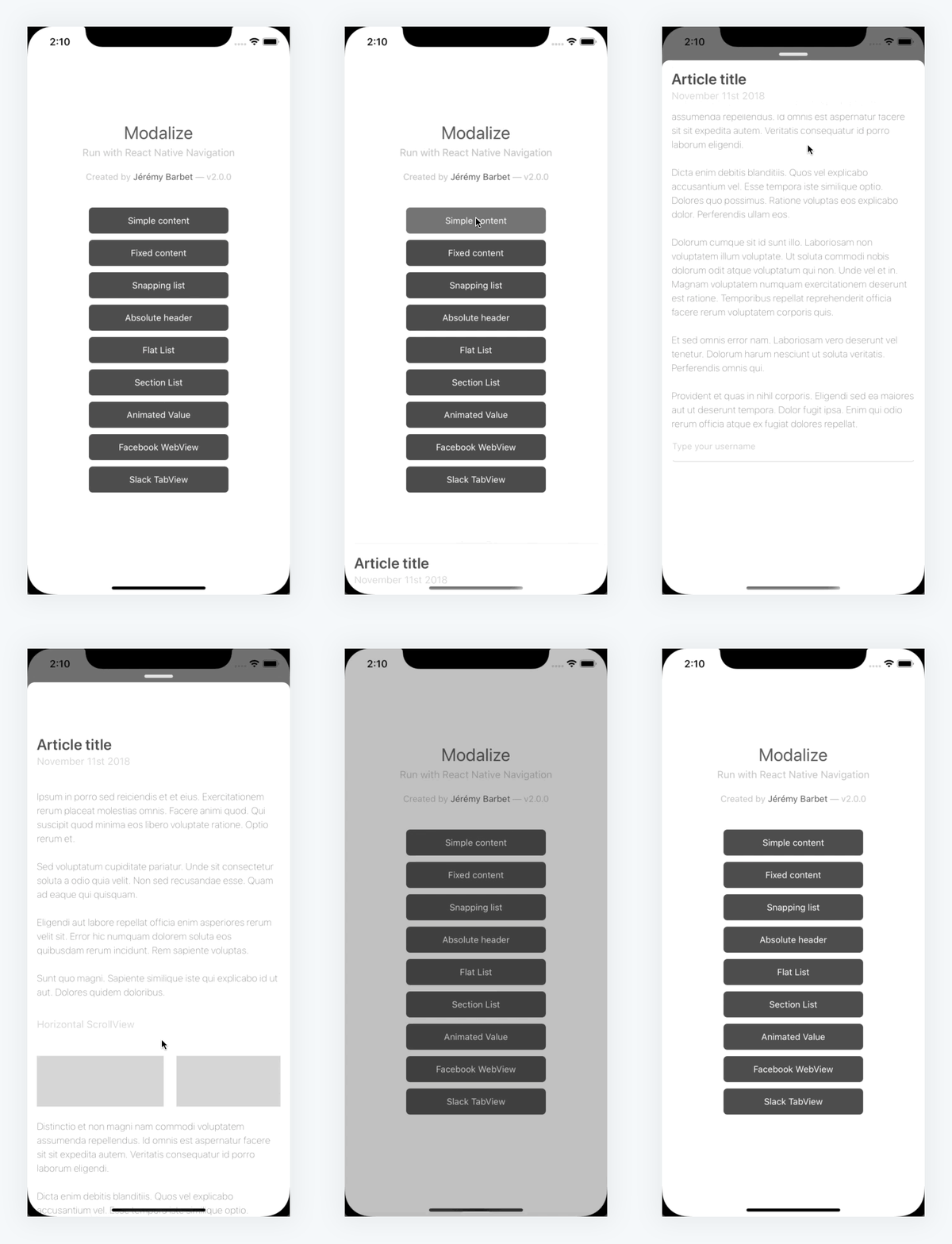
React Native Modalize is a powerful and customizable modal/bottom sheet library designed for seamless scrolling interactions. Built on react-native-gesture-handler, it addresses common scrolling and keyboard handling issues. It offers default renderers like ScrollView, FlatList, and SectionList, ensuring a smooth user experience. Modalize simplifies complex content display and is a popular choice for creating sophisticated modal components in React Native applications.

2. Bottom Sheet
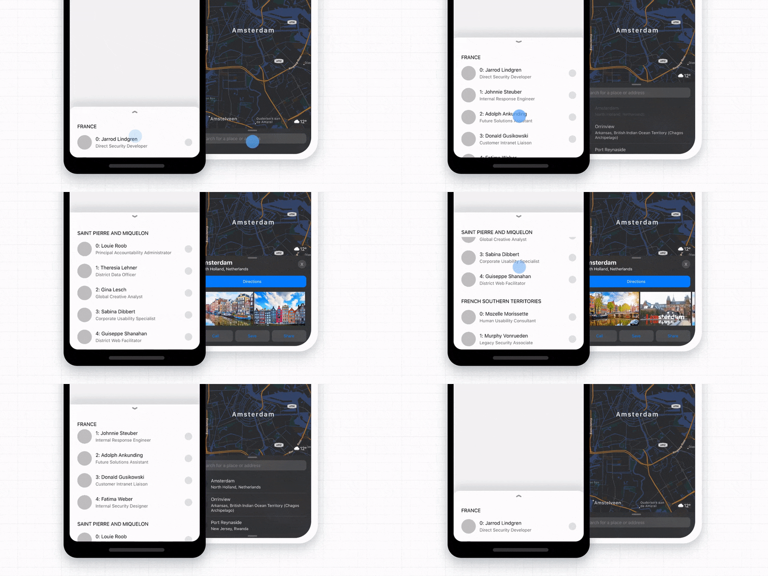
React Native Bottom Sheet is an overlay modal offering a bottom sheet modal that slides up from the bottom of the screen, commonly seen in popular apps like Twitter and Instagram. It provides a customizable and draggable overlay to display additional content or extended descriptions within a mobile application.

3. React Native Popup Dialog
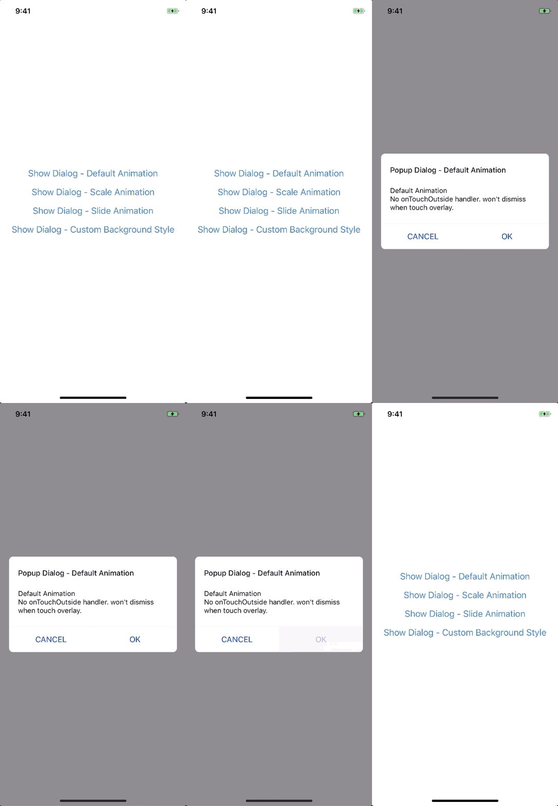
In React Native, a Popup Dialog modal is a handy user interface element appearing as a pop-up on the screen. With diverse customization options like animation effects and styles, developers can craft visually appealing modal dialogs for displaying messages, alerts, or user interactions.

When choosing a modal component, consider factors such as customization options, animation types, and how well it integrates with your application’s design. Additionally, keep in mind the maintenance and popularity of the library to ensure long-term support.
How to implement the most widely used Modal in React native app?
The ‘React-Native-Modal’ is one of the most commonly used modal in developing a React Native application.Let’s understand the implementation with an example of React Native Modal
If you click the buttom on the screen, a message popup will be displayed “Do you want to exit?”
Answer options should be “Exit” or “no”
SetUp
Use library that is available on npm, install it with:
‘npm i react-native-modal’ or ‘yarn add react-native-modal’
Implementation:
To implement a modal in React Native app development project, you can use the react-native-modal library to create the modal component. Here’s a step-by-step guide:
1. First, install the required library:
To implement a modal in a React Native app with the specific requirements you mentioned, you can use the react-native-modal library to create the modal component. Here’s a step-by-step guide:
npm install react-native-modal
2. Now, you need to create a new React Native component that will serve as the main screen. We can call it as ‘HomeScreen.js’
| 1 2 3 4 5 6 7 8 9 10 11 12 13 14 15 16 17 18 19 20 21 22 23 24 25 26 27 28 29 30 31 32 33 34 35 36 37 38 39 40 41 42 43 44 45 46 47 48 49 50 51 52 53 54 55 56 57 58 59 60 61 62 63 64 65 66 67 68 69 70 71 72 73 74 75 76 77 78 79 80 81 82 83 84 85 86 87 88 89 90 | // HomeScreen.js import React, { useState } from 'react'; import { View, Text, TouchableOpacity } from 'react-native'; import Modal from 'react-native-modal'; const HomeScreen = () => { const [isModalVisible, setModalVisible] = useState(false); const toggleModal = () => { setModalVisible(!isModalVisible); }; const handleExit = () => { // Handle the exit action here // For now, let's just log a message console.log('Exiting the app'); setModalVisible(false); }; return ( <View style={{ flex: 1, justifyContent: 'center', alignItems: 'center' }}> <TouchableOpacity onPress={toggleModal}> <Text>Show Exit Modal</Text> </TouchableOpacity> <Modal isVisible={isModalVisible}> <View style={{ flex: 1, justifyContent: 'center', alignItems: 'center' }}> <Text>Do you want to exit?</Text> <TouchableOpacity onPress={handleExit}> <Text>Exit</Text> </TouchableOpacity> <TouchableOpacity onPress={toggleModal}> <Text>No</Text> </TouchableOpacity> </View> </Modal> </View> ); }; export default HomeScreen; |
3. Your next step is to import and use the HomeScreen component in your main App.js or wherever you want to integrate it:
| 1 2 3 4 5 6 7 8 9 10 11 12 13 | // App.js import React from 'react'; import HomeScreen from './HomeScreen'; const App = () => { return <HomeScreen />; }; export default App; |
In the above example, we’ve used “react-native-modal” to create a pop-up window (modal) in React Native application. This modal serves the purpose of prompting the user with a question about exiting the app.
The use of ‘react-native-modal’ essentially provides us with the capability to smoothly integrate and display this modal within React Native app, enhancing the user experience by presenting a clear and interactive exit confirmation.
1. Modal Visibility
- The isVisible prop of the modal determines whether it’s visible or not.
- There’s a piece of state called isModalVisible that keeps track of whether the modal is currently visible or hidden.
- The toggleModal function is responsible for changing the state of isModalVisible, effectively showing or hiding the modal when called.
2. Modal Content
- Inside the modal, there is a simple message asking the user if they want to exit.
- There are two touchable elements (buttons) with the labels “Exit” and “No.”
3. Button Handlers
- The “Exit” button has a handler function called handleExit. This function is currently set to log a message to the console, indicating that the app is exiting.
- The “No” button has a handler function called toggleModal, which hides the modal without taking any exit action.
4. Customization
It is advised to customize the handleExit function based on your specific requirements. For now, it logs a message, but in a real application, you would implement the necessary logic for exiting or navigating away.
In short, this code provides a basic structure for creating a modal in a React Native app development project, prompting the user to confirm if they want to exit. You can customize the exit logic in the handleExit function to suit the needs of your application.
How can DianApps help integrate various Modals in the React Native App?
DinaApps is a React Native App Development Company that can help you implement modals. Our experts try their best to understand the performance of your existing app, prioritize bugs, and even resolve the issues of your React Native apps.
Being a top-notch mobile app development company in the USA, DianApps assists you in increasing conversion rates and product usage capabilities by showing you exactly how your app’s users are interacting with your application.
Get in touch with our experts for state-of-the-art React Native app development services.
Also read: How to build your app with React Native in 10 days!
Conclusion
By the end of this blog, you must have understood what modals are as well as how they work. We hope this example will help you in creating a custom modal that can enhance the user interface of your React Native application. These modals are indeed great for integrating calls-to-action in the app.
Lastly, if you still have any concerns, we would advise you to get in touch with experts from a React Native app development company like DianApps to achieve the best results.


Leave a Comment
Your email address will not be published. Required fields are marked *