While creating the design layout for a mobile app, designers have the option of thinking the iOS way or the Android way. There are several ways to work around these two different flavors of application interface designs, and a good designer needs to know their way around both of them. No need to have the expertise, a simple idea of the do’s and the don’ts will do.
The key highlights of Android and iOS have also made themselves felt through the ripples in investment markets and in popularity trends across different demographics. Understanding some of the subtle differences in the UX/UI design between the two app design systems can really pay off if you’re working at a mobile app development company that prides itself on dabbling with both these platforms. Being everyone’s going to option all sorts of assistance and a pivotal aspect of a businesses’ digital transformation pursuit. A well-planned out mobile app is sure to get your audience humming with nothing with appreciation and amazement.
When you skim through the surface, the differences between the two might seem fairly obvious and simplistic. But understanding the nuances of building the user interface for either of these platforms is critical to navigating through the UX/UI design of your applications and ensuring their peak functionality on any kind of device.
We have extracted some of the essential contrasting features of the iOS and Android systems to highlight the design spectrum of app development:
The key differences between Android and iOS Design
I. Control Features
There are several differences in the placement of the control features in Android and iOS systems. They have different ways of accessing the modularity that lets you select or search for different things on your mobile phone.
Call to Action Button: The primary call to action feature on Android devices is a floating button at the top or even at the edge of some app components. On iOS systems, they are typically found on the upper-right side of the screen.
Search Button: The search button on Android devices is always found as a tab at the top of the page. In iOS systems, the search tab can also disappear while scrolling and reappears when dragged from the top. Canceling a search query on Android requires a user to press the back arrow while in iOS you can perform the function by selecting the cancel button.
Selection Boxes: For Android systems, there are two ways that the options in a selection box can present themselves. They can be a modal dialogue box or a drop-down menu. In iOS designs, there is a picker control tethered at the bottom of the page. This appears with the options listing once the control is selected.
Cards: Cards are used by both iOS and Android platforms as a means to display information in an inventive way that occupies the least space and shows the most relevant content. In Android design, the cards are modeled with rounded edges and shadows while in iOS you can find these cards as plain rectangular segments occupying the whole width of the screen.
Tabs: Tabs are found as segmented buttons in iOS while Android screens have a flat continuous tab.
Alerts: Alerts can appear on your screen in different ways when you’re using iOS versus when you’re using Android.
II. Navigation
Navigation is one of the critical components to keep in mind while planning the design layout of an app. It deals with how you provide connectivity between different tabs or apps and how you can allow a user to move around to access the phone features.
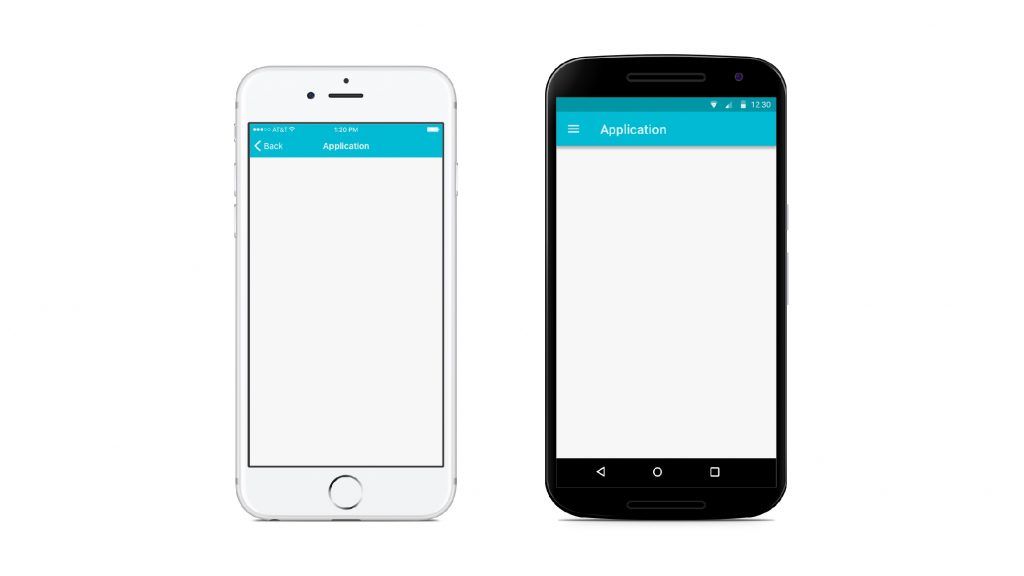
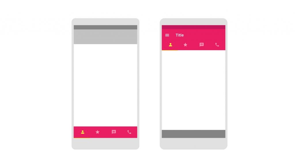
Primary Navigation: In an Android device, you can find the primary navigation buttons which let you connect to the main app pages placed in different parts of the screen. For iOS apps, these are found at the bottom of the screen. They are arranged horizontally in a series of icons.
Secondary Navigation: The secondary navigation button for an Android device is found in the top left corner of the top navigation bar as a hamburger icon. Clicking on it gives a drop-down box with the secondary navigation tools. iOS devices have an option called more in the global navigation bar for the same function.
Top Screen Navigation: At the top of the Android device, you find the drawer icon, the name of the page, the search bar, and the overflow menu. iOS devices display the previous page, current page, and then have an action button.
Back Navigation: Android devices have a back button at the button of the screen while iOS devices give their user the option of sliding from left to right or pressing the back arrow at the top left corner of the screen.
III. Buttons
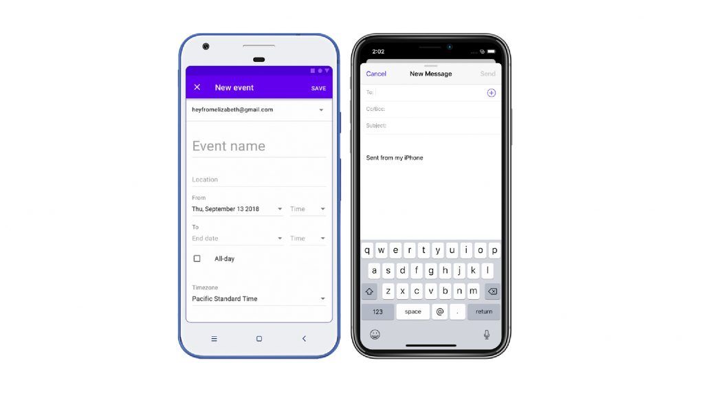
Buttons are visual tools that allow the user to access different features. The graphical image used for buttons are usually the same on different platforms, but their representations can vary considerably.
In Android devices, the buttons have shadow outlines and support different alphabet cases while iOS does not have this kind of display.
IV. Typography
Android and iOS both have their preferred fonts for their display icons. The default font type for Android is Roboto while iOS prefers the San Francisco format. This feature can be customized and is more of a guideline than a rule.
V. Display and Icons
The icon sizes are strongly pre-defined and differ for different screen sizes. Both iOS and Android designs have differently prescribed pixel resolutions which need to be factored in while designing the app.
There are also interesting differences in finer display features like selecting a date from the options menu. In Android devices, users get to or select from a drop-down while in iOS there is a spinner model.
Conclusion
The component of UX/UI design is extremely critical for mobile apps as it defines the fundamental usability of an application. Designers should always plan their app while keeping its overall appearance in mind. The Android way and iOS way of thinking have multiple convergent points and they aren’t all that different in structure. Even though they are based on similar app design fundamentals, it is always important to remember their key differences while starting a project. If it seems a lot to take care of, then getting in touch with a professional app development company is the best option left.
Companies and individuals creating an app have to compete in the million-dollar app market by integrating different platform design services. Multi-platform app designing software is highly capable of allowing app designers to build both iOS and Android-based apps. Designers can easily curate both and use mutual competition and growth between these systems to their benefit.






Leave a Comment
Your email address will not be published. Required fields are marked *