Minimalism has emerged as a popular digital design concept, intending to remove unneeded information from websites and apps. This strategy, embodied by the adage “less is more,” prioritizes important elements for quicker navigation and a better overall user experience. Minimalistic design trends have continually dominated the digital design market in recent years, with simple layouts in websites and applications. The design Key for ideal balance between usability and aesthetics, resulting in designs that are not only visually appealing but also user-friendly. Eliminating extra components from a website’s UI design simplifies the user journey, ensuring that minimalist design remains a trustworthy and effective option.
The Minimalist UX Trend
Designers and Developers have benefited greatly from the trend toward simplicity. It has enabled them to produce more intuitive and impactful user-centered designs. Despite its simplicity, minimalist design is quite simple and promotes usability above visuals. These designs load faster, use fewer resources, and may be created in less time than more sophisticated websites. They also adjust to varied screen sizes, making them excellent for mobile devices. Adaptability to mobile devices and loading time are important SEO considerations. Minimalist design has always stayed in style and is a preferred choice among designers.

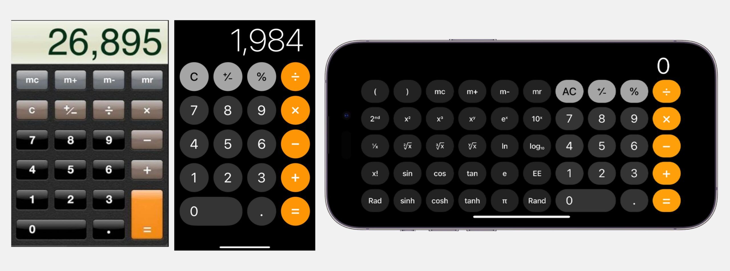
Throughout the iOS upgrades, Apple has moved toward a simple UI design. The calculator is an excellent example of this change.
The Role of Minimalism in UX Design

Aesthetic and minimalist UX design
Aesthetics are increasingly being used to determine functionality in today’s landscape. When deciding between good and bad designs, it is clear that aesthetics are prioritized. This trend has pushed designers to focus on minimalist design, which is noted for its pleasant aesthetics and easy navigation. Opting for a minimalist website design is consistent with the goal of visual appeal in all aspects.
Users have become accustomed to minimalist user experience (UX) design, which increases the likelihood of successful conversions. From a business standpoint, the emphasis is on providing good experiences enhanced by aesthetically beautiful design.
Easy & fast navigation
When planning a website or app, it is critical to keep things basic and minimalist. This entails minimizing extraneous elements that clutter the screen and make it difficult for people to find what they require. By streamlining the design, users may execute their intended duties without delay.
A minimalist UX design helps to reduce the consumers abandoning your product or website, by making its user experience simple and intuitive which improves the overall experience of the users.
Content first = User first
The minimalist UX design focuses on content, making it more user-centric. Users will be more lured in if the visual design is appealing and the copy is effective. By focusing solely on the vital parts, content becomes an important piece of communication on your website.
Fast page-loading speed
The minimalist UX design includes fewer elements overall, so your internet page will load quickly. This serves as a competitive edge for your organization.
Responsive layouts make it easy
With a minimal UX design, you only include the most crucial features and content on your website. This makes it easy to guarantee that the design is responsive and accessible across a variety of devices. As a result, basic designs take less time and effort to construct.
Best Practices for Minimalist UX Design
Minimalist product design prioritizes user experience and behaviour. Here are some important principles of minimalist UX design:
Using Negative space or white space

White or negative space is an important aspect of minimalist design. Negative space is the area surrounding crucial features that contribute to visual equilibrium. White space, on the other hand, refers to the space surrounding items that allow them to stand out and breathe. White and negative space work well together to create a minimalist design by removing distractions from your screen, making navigation quicker, and accentuating CTAs. They’re like the foundation of a good design.
The right & thoughtful use of color

Choosing the proper color palette is important in simple design since it displays your business image. colors can elicit a variety of emotions in people, so it’s critical to select colors that are consistent with your brand statement. Color palettes for minimal design are typically more subtle, with monochromatic and analog color schemes that are brighter. Most essential, your website’s color palette should include no more than two to three hues.
Bold and expressive minimal typography

Typography is as significant as photos in terms of visual impact. Choosing the proper fonts and appealingly mixing them is critical. Sans-serif fonts are a good choice for designing a minimalist product due to their sharp and clean appearance. I recommend choosing popular geometric sans-serifs such as Gilroy, Sofia Pro, Lufga, and Circular. Other typefaces to try are Pulp, Gordita, Visby, Konnect, Geliat, Galano, and Jakarta Sans.
Flat design

One of the distinguishing characteristics of this design style is the use of flat 2-dimensional visual details rather than extremely realistic and rich skeuomorphic imagery. Flat images typically have fewer components and curves, and they avoid highlights, shadows, gradients, and textures. This technique enables designers to generate graphics, buttons, icons, and illustrations that appear clean and concise in a variety of resolutions and sizes. It improves the usefulness and visual harmony of the user interface.
Photos and Illustrations

One advantage of using minimalist UI/UX design service elements is that their plain appearance allows pictures and graphics to make a stronger impression on the user. Grid systems also provide built-in padding, which offers an aesthetically acceptable separation between images and UI components. Nowadays, consumers prefer photographs over graphics because they appear more realistic and allow them to emotionally connect with real-life experiences.
Limited use of effects

Minimalism takes inspiration from a variety of styles and effects. This features delicate colorful shadows, hazy aurora backdrops, embosses, and glass morphic elements that can be applied to varying degrees. This keeps the interface readable and visually uncluttered.
Focus on contrast

Minimalism is based on the principle of limitations and simplicity, and contrast is a potent tool for effective visual display. Contrast is frequently used as the key attribute while selecting colors, forms, and placement. Sufficient contrast allows us to distinguish between the backdrop and the items, understand the visual hierarchy, and navigate the interface with ease.
Minimalism Is More Than an Aesthetic
Minimalist UX design improves the user experience and promotes long-term engagement. It helps lower cognitive overload and allows users to find what they’re looking for more efficiently.
Happy Reading!


Leave a Comment
Your email address will not be published. Required fields are marked *